The Alexandrian

Go to Part 1

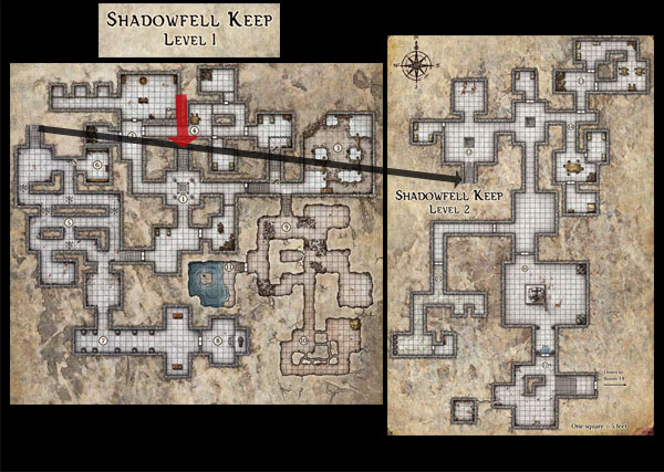
This is the complete map of the Keep of the Shadowfell, taken from the adventure of the same name. (The red arrow indicates the dungeon’s entrance. The black arrow indicates the connection between Level 1 and Level 2 of the dungeon.) At first glance, this dungeon may appear quite complex and interesting: There are lots of twisting corridors, and the PCs appear to be given an immediate and meaningful choice of three separate corridors upon entering the dungeon.

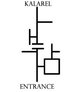
But as I mentioned earlier, when you straighten out all of those twisting corridors the overwhelmingly linear structure of the dungeon becomes quite clear:

The only legitimately interesting feature of this dungeon, from a cartographical standpoint, is the loop of encounters in areas 1 thru 4. Everything else in the dungeon has been designed to proceed in an essentially predetermined fashion: The DM sets up the encounters, the PCs knock them down, and then the DM sets up the next encounter.

What I’m going to do is take a few simple xandering techniques and use them to tweak the Keep of the Shadowfell in order to make it a more dynamic and interesting dungeon. By changing the macro-structure of the dungeon, we’ll be able to unlock the full potential of the “local interest” in the map (all those twisting corridors and mini-loops) and the encounters themselves.

To do this, I’m going to suggest making four slight adjustments to the dungeon’s design.

SECOND ENTRANCE: As described in my original remix of Keep on the Shadowfell, add a second entrance to the dungeon. About a half mile to the west of the keep, up in the foothills of the Cairngorms, there’s a natural cave that leads, more or less directly, to area 10 of the Keep.

(This is how the kruthiks and rats got into areas 9 and 10. As described in the remix PDF, the PCs can discover this entrance either by scouting the area around the Keep or by researching it in Lord Padraig’s library in Winterhaven. If this entrance is found before the PCs enter the Keep, it’s a nice reward for their cleverness and preparation. If it’s found during their explorations of the Keep, it can provide a valuable avenue of escape or allow them to sneak back into the complex after a guard has been raised at the primary entrance.)

ADDING A STAIRCASE: Add a staircase leading from the Torture Room (area 2) to the antechamber of Sir Keegan’s tomb (area 7).

(My primary motivation here is to remove some of the dead ends from the dungeon. By linking two of the dead ends together, I’m creating a dynamic loop. Note, however, that I’m actually linking the loop in just before the actual dead end of Sir Keegan’s tomb in area 8. This is partly due to the internal logic of the adventure – it doesn’t make any sense for a hallway to pass straight through Keegan’s tomb – but it’s also practical in terms of design: By leaving the branch into area 8 intact, we’re providing a flavorful navigational choice to PCs entering area 7.)

ADDING A SECRET PASSAGE: Add a secret passage leading from area 6 to area 15.

(This provides a second connection to the lower level, providing the dungeon with important multiple connections between levels. By properly positioning these connections, we can turn entire dungeon levels into looping structures.)

MOVING A STAIRCASE: Move the staircase leading to area 12 from area 5 to area 3.

(The primary reason for this shift is to open up some real estate between the primary and secondary routes leading to the lower level. Admittedly, this is a problem that only exists because of where I chose to put the secret passage. But this also allows the goblins to reach the lower levels without passing through undead-infested halls, thus correcting a problem with the original dungeon’s design. And by hooking a level connector into the far end of the adventure’s original loop we’re layering the complexity of the dungeon’s cartography.)

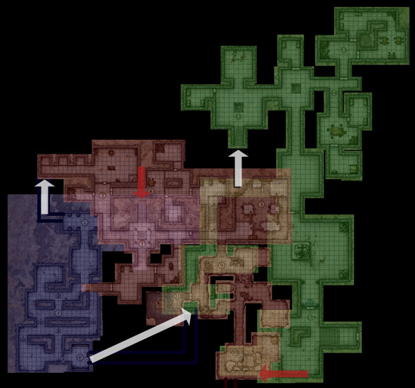
Finally, in order to make these changes fit into a natural, logical geography, I’ve simply inverted the entirety of areas 6 thru 8. With this change, these areas, which were originally a minor elevation shift requiring the PCs to descend a staircase from area 1, become a true “second level” to the complex, passing directly beneath areas of the first level:

(Level 1 is highlighted in red. The “new” Level 2 is highlighted in blue. And Level 3, the original second level, is now highlighted in green.)

Next: Xandering for Fun and Profit

You’ll frequently hear authors and IP companies bitching and moaning about the fact that they don’t see a penny when their copyrighted material is sold on the used market. Even otherwise fairly intelligent folks like Isaac Asimov have irrationally believed that people buying used paperbacks were sticking daggers in their backs.

Even if we ignore the ethically tenuous position of people who want to sell you a toaster and then prohibit you from ever selling that toaster to somebody else (which a few weeks ago I would have considered hyperbole, but then the Ninth Circuit Court of Appeals decided it would be a good idea to gut consumer protection and ship American jobs overseas all in one fell swoop), the claim being espoused here is fundamentally nonsensical.

What they’re overlooking (either willfully or ignorantly), is the actual effect that being able to sell used books has on the original customer’s buying habits:

First, it influences their decision to buy. (“I’m willing to pay $50 for this textbook, but only because I know I can sell it back for $15 at the end of the semester.”) If they weren’t able to recoup a portion of their investment, they might never buy it in the first place.

Second, it amortizes risk. (“I dunno if this DVD is worth $20. But I guess if I don’t like it, I’ll be able to sell it for at least $8. $12 isn’t that much of a risk.”) Customers who can amortize their risk are more likely to buy. And if the product turns out to be good, they may not resell at all.

Finally, it injects fresh capital: The $10 you get from GameStop for your video game is often going right back into purchasing a brand new game at GameStop.

This effect is somewhat diffused and may, therefore, not be clear when it comes to books or DVDs or video games. But it’s crystal clear when you look at the auto industry: X buys a $30,000 car from Ford. X sells it a couple years later to Y for $10,000 and uses that money to buy another $30,000 car. A couple years later X sells his new $30,000 car to Y for $10,000, while Y sells the original car to Z for $2,000.

Holy shit! Ford has lost all that money spent by Y and Z! X is ripping Ford off! … right?

Nope. Because (a) X couldn’t afford to buy a $30,000 car every two years if he wasn’t selling to Y; and neither Y nor Z can afford $30,000 new cars. The money from Y and Z is, in fact, funneling right up the system and into Ford’s pocket. And everybody wins: Ford makes more money. X gets fancy new cars on a more frequent basis. Y and Z get cars they otherwise couldn’t afford.

This is why nobody in the auto industry makes a new car that they can sell for $5,000 despite the obvious market for $5,000 vehicles.. They’re already getting the money from the $5,000 market.

Go to Part 1

There is a temptation to think of the complexity arising from the Xandering Techniques as being inherently chaotic – a “funhouse dungeon” that doesn’t make any logical sense. But while that certainly can be true, the reality is that these techniques actually result in more realistic designs.

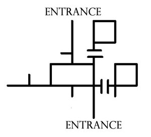
For example, consider the layout of my house. Ignoring windows (which effectively turn every room in the house into a potential point of entry), the Melan diagram looks like this:

I (tragically) don’t have much in the way of secret paths, sub-levels, or non-Euclidean spaces, but even in this simple structure we can see multiple midpoint entries and looping paths. I think if you take a moment to consider the architecture of the world around you, you’ll discover that linear paths are the exception and not the rule.

And yet how often do we see a D&D module featuring a giant mansion without any windows? (Because if there were windows, the PCs would be able to break through them and ruin the DM’s carefully orchestrated railroad.)

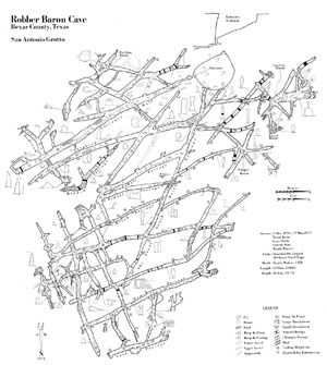
Nor is this effect limited to man-made structures. Consider, for example, this map of Robber Baron Cave, complete with hidden passages (click for a larger image):

It’s complex to the point of being virtually ungameable. (Although I take that as a challenge even as I type it.)

SIZE: My decidedly non-palatial house also makes the point that dungeons don’t have to be large in order to take advantage of xandering. For example, the map I designed for Darkwoods’ Secret only featured a dozen locations, but the flow of the dungeon looks like this:

This smaller scale actually highlights the gameplay impact of non-linear dungeon designs. It becomes very easy to see the many different ways in which the dungeon can be played: Can certain dangers be avoided? Will the PCs or the monsters determine the field of engagement? Where will reinforcements be coming from? What viable lines of defense can be held?

BEWARE THE SPRAWL: None of this, however, is to say that you should never use branching paths or create chokepoints for accessing the lower levels of the dungeon. (Any more than it is to say that every single means of egress should be secret or unusual.) It is merely to say that such features should be used to effect and not simply by default. Variety is the spice of dungeon design, after all.

It’s also important to realize that there really can be too much of a good thing: There is a point at which endless loops and countless connections within the dungeon result in meaningless choice instead of meaningful choice. In xandering your dungeon it’s important to beware this featureless sprawl of ever-looping corridors.

STRUCTURE IN THE DUNGEON: A comprehensive guide to effective dungeon design is beyond the scope of this essay, but there are a couple of useful barometers you can use in the process of xandering.

Difficult vs. Easy: Looking at your map, there should be areas of the dungeon which are difficult to reach and areas which are easy to reach. In saying this, I’m not specifically referring to isolated secret rooms (although there’s nothing wrong with those), but rather with large sections of the dungeon.

In making this assessment you are diagnosing whether you’ve made the dungeon too boring by making the choice of path through the dungeon irrelevant. You want the dungeon to benefit from being interconnected, but if everything in the dungeon trivially connects to everything else then navigation becomes meaningless.

Far vs. Near: Similarly, have the interconnections made your dungeon too shallow? Look at where the PCs will be entering the dungeon. There should be areas of the dungeon which feel far away from these entrances. If everything in the dungeon feels equidistant, break some of those connections or delve a little deeper in your design.

Note that “near” and “easy to reach” portions of the dungeon aren’t problems to be eliminated. What you’re looking for is an effective balance in the mix between all four of these design elements (difficult, easy, far, near).

LANDMARKS: Finally, the complexity of connections within a properly xandered dungeon can also leave the players feeling somewhat adrift. In some cases this can be taken advantage of. In other cases, it’s a problem that needs to be solved.

I started map development by literally copying and pasting a large chunk the Alpha Base ruins into one corner of the map. This established a particularly unique landmark in that corner. These large landmarks in skirmish maps help players immediately know where they are and let them navigate from point to point by in-game visual references. Ideally, each “corner” of any skirmish map is visually unique, and this was my design goal with Terminal Moraine.

Jennell Jaquays – Terminal Moraine Design Notes

Different context, but Jaquays provides the solution once again. In order to successfully navigate a dungeon, the players will need distinct, memorable landmarks to orient themselves.

If you’re designing a dungeon with lots of unique, interesting features, this problem will generally take care of itself: The players will glom on to whatever details particularly resonate with them, and use those details to guide themselves. On the other hand, it can never hurt to do another quick pass on your design and add in a few deliberate landmarks: A large bloodstain. A unique statue. A room of strange runes.

Of course, players may also provide their own landmarks: “Hey, it’s that ogre we killed last week. Awesome.”

On the other hand, you may also be able to use landmarks to mess with your players. Some landmarks could easily disappear. (An ogre’s corpse that gets dragged away by scavengers.) Those unreliable landmarks then open the question of how a missing landmark should be interpreted. (The runes are missing. Does that mean we’re in a different room? Or have the runes vanished?) And some landmarks which might seem unique could easily prove otherwise. (There’s the golden statue of a cyclops in a hexagonal room… but I thought that was on the other side of the complex. Did we get turned around?)

To flip it around one last time, particularly crafty DMs might be able to hide reliable navigation information into seemingly unreliable landmarks.

Next: Xandering the Keep on the Shadowfell

Go to Part 1

Let’s start by taking a look at some of the basic techniques you can use while creating non-linear dungeons.

Some of these techniques are designed to offer complex geographic relationships (out of which meaningful choices can naturally arise). Others are designed to confuse the mapping of the complex (or, even in a game dynamic without player mapping, to confound their general understanding of the complex). The point is not (necessarily) to create a maze-like environment, but rather to create an environment of sufficient complexity that the “hand of the author” and the underlying structure of the dungeon environment become obfuscated.

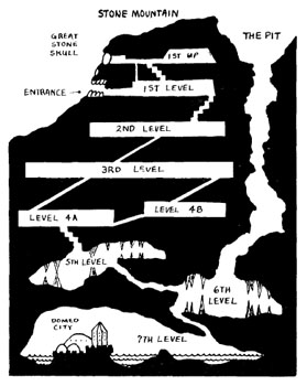
MULTIPLE ENTRANCES: Multiple entrances give the PCs an immediate strategic choice as they approach the dungeon complex. Hidden secondary entrances also reward exploration both inside and outside of the dungeon, allowing for favorable approaches and quick escapes. In terms of structure, multiple entrances effectively create an additional “loop” (see below) through the surface above the dungeon.

For example, consider the classic Stone Mountain dungeon from the 1977 D&D Basic Set, designed by Tom Moldvay and Tom Wham:


From the Holmes’ Basic Set (1977)

LOOPS: Branching paths in a dungeon allow for choice, but are still functionally linear in their design. (In practice, you will follow a branch to its end; backtrack; and then go down a different branch. But each branch still presents a linear experience.) Where things get interesting is when you grab a couple of those branches and hook them together into a loop. These loops are the basic building blocks for non-linear dungeons: They provide meaningful strategic and tactical choices; make exploration meaningful; and allow PCs to find alternative routes around or through potential threats.

MULTIPLE LEVEL CONNECTIONS: If there is only a single route leading to the next level of the dungeon the complexity of the current level is collapsed into a chokepoint. But if you introduce multiple connections between the dungeon levels you create a synergy between complex level designs. Just as you create new structural loops by including multiple entrances to the dungeon, each additional connection you draw between levels creates new looping paths through the dungeon.

DISCONTINUOUS LEVEL CONNECTIONS: In a linear design, the levels of a dungeon must proceed in their predetermined order: Level 1 leads to Level 2. Level 2 leads to Level 3. And Level 3 leads to Level 4.

But once you introduce multiple connections between levels, you are free to have some of those connections skip levels. For example, there might be an elevator on Level 1 that takes you down to Level 3. Or a hidden tunnel on Level 4 that takes you back to the surface a half mile away from the dungeon’s main entrance.

SECRET & UNUSUAL PATHS: These are fairly self-explanatory. They reward curiosity and exploration, and can also breathe fresh life into areas of the dungeon which have already been traversed.

One thing to note is that not every secret path needs to take the conventional form of a camouflaged doorway: Tunnels that have suffered cave-ins. Traps that drop you to lower levels. Archaic teleportation systems that must be decoded. Rope bridges that cross over caverns that can also be explored from below. A submerged bypass connecting two seemingly unrelated lakes.

And here, too, you benefit from the non-linear design of the xandered dungeon: Because there are other viable paths for the PCs to explore, you can include truly esoteric, unusual, and flavorful paths that may be missed by the unwary (and, therefore, appreciated all the more by those who do discover them).

SUB-LEVELS: The distinction between a “level” and a “sub-level” is somewhat arbitrary, but perhaps the defining characteristic of the sub-level is that it departs from the main “sequence” of the dungeon. It may be smaller than the other levels of the dungeon; it may be difficult to reach; or both. As such, sub-levels serve as boulevards of discovery or elaborate shortcuts (or both).

DIVIDED LEVELS: Similar to the concept of a sub-level is that of the divided level. While existing within the main “sequence” of the dungeon, a divided level cannot be completely traversed without going through the levels above or below it.

For example, on the second level of the dungeon one might find two staircases both leading down to the third level. But on the third level itself, there is no path which connects the two staircases. (Or, if there is such a path, it may be incredibly well hidden or difficult to traverse.)

NESTED DUNGEONS: Nested dungeons are sort of like sub-levels or divided levels on steroids. Imagine designing two separate and distinct dungeon complexes, but then linking them together at selected locations. (For example, consider the Lost Temple of the Gorgons and the Obsidian Caverns as both being fully developed dungeon complexes, each with multiple levels and sub-levels. You could nest the Lost Temple within the Obsidian Caverns by creating two links between the complexes: A long passage on the first level of the former might lead to the third level of the latter. And a teleportation pad on the sixth level of the latter might lead to the fifth level of the former.)

As a practical demonstration of this technique, consider Jaquays’ Dark Tower:
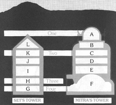
Both Set’s Tower and Mitra’s Tower are nested into the four primary levels of the dungeon.

MINOR ELEVATION SHIFTS: When the PCs come to a staircase they may naturally assume that they are going up or down to a new level of the dungeon. But by including minor elevation shifts within the topography of a single dungeon level you can confound their expectations. Here’s an example from the Temple of Elemental Evil by Gary Gygax and Frank Mentzer:
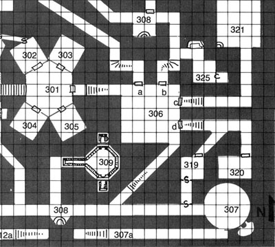
In addition to short stairways and misleading slopes, you can also include tunnels that loop under each other while technically remaining on the same “level” of the dungeon. It’s also important to “think vertically” within rooms as well.

These techniques aren’t just a matter of confusing the players’ mapping. You are disrupting their ability to intuit the organization of your maps by analyzing the reality of the game world. While maintaining clean and simple maps for your own use and reference, you are creating a world that not only seems more dynamic and complex, but actually is more dynamic and complex.

Basically, don’t fall into the trap of thinking that just because your map is two-dimensional that the world should be two-dimensional.

MIDPOINT ENTRY: I don’t think Jaquays ever used this technique, but you can complicate the players’ approach to the dungeon by creating immediate bilateral exploration. In other words, PCs entering a dungeon are usually only faced with one navigational question at the macro-level: “How do we get down to level 2?”
But if the PCs are instead entering in the middle of the dungeon – with levels above and below them – then they’re first faced with a tougher question: “Which way do we go?”

Note that this decision point is similar to the one faced by PCs who have “skipped” a level as a result of a discontinuous level connection. It is also similar to the situation faced by PCs who have taken advantage of a hidden entrance leading to a lower level of the dungeon. The distinction of the midpoint entry is that it is the expected, default entry point to the dungeon. (And in classic dungeon arrangements, where difficulty corresponds to dungeon level, the difficulty of the dungeon would increase in both directions away from the midpoint entry.)

NON-EUCLIDEAN GEOMETRY: If you want to have some real fun, consider using non-Euclidean geometry. These Escher-inspired designs can result in counter-intuitive navigation and may even result in PCs moving between levels without realizing that it’s happened. For examples of non-Euclidean design, check out my work on FFG’s The Lost Hunt and the award-winning Halls of the Mad Mage.

EXTRADIMENSIONAL SPACES: Sections of a dungeon complex may lead into areas completely beyond the dungeon itself while still remaining intimately tied to the dungeon’s topography and/or experience. For example, Gary Gygax’s EX1 Dungeonland module detailed a Wonderland-inspired demi-plane that could be accessed deep below Castle Greyhawk. I’ve read about another DM incorporating the lost island of X1 The Isle of Dread as a similar demi-plane within their megadungeon complex.

While such excursions can certainly breathe a little air into a claustrophobic dungeon delve, I think it remains an open question where the distinction between an extradimensional space which “belongs” to the dungeon and a teleportation effect which simply takes the PCs out of the dungeon entirely actually lies. In practice, the line between the two is probably more a blur than a distinct demarcation.

Laying aside these broader questions, I include extradimensional spaces in the list of xandering techniques because they also allow you to super-impose multiple areas into a single geographic space.

Next: The Philosophy of Xandering
Since we’re going to be discussing the Caverns of Thracia extensively as part of the Xandering the Dungeon essays, I finally motivated myself to collect the campaign journal / exploration of OD&D that I wrote in early 2009 so that they could all be accessed through one handy link. Check it out:

Part 1: Character Creation
Part 2: The First Foray
Part 3: Death in the Ruins
Part 4: The Second Party
Part 5: The Final Foray
Part 6: The Second Session
Part 7: The Twin Travails of Thalmain
Part 8: The Massacre of Fire

UPDATE: The following posts also contain thrilling exploits from the dungeon:

The Intemperate Jungle
My Favorite Character Sheet

You might also want to check out the (Re-)Running the Megadungeon essays, which use a behind-the-scenes peek at this campaign as an example of how to properly run a megadungeon.

Archives

Recent Posts


Recent Comments

Copyright © The Alexandrian. All rights reserved.