There is a temptation to think of the complexity arising from the Xandering Techniques as being inherently chaotic – a “funhouse dungeon” that doesn’t make any logical sense. But while that certainly can be true, the reality is that these techniques actually result in more realistic designs.
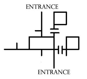
For example, consider the layout of my house. Ignoring windows (which effectively turn every room in the house into a potential point of entry), the Melan diagram looks like this:

I (tragically) don’t have much in the way of secret paths, sub-levels, or non-Euclidean spaces, but even in this simple structure we can see multiple midpoint entries and looping paths. I think if you take a moment to consider the architecture of the world around you, you’ll discover that linear paths are the exception and not the rule.
And yet how often do we see a D&D module featuring a giant mansion without any windows? (Because if there were windows, the PCs would be able to break through them and ruin the DM’s carefully orchestrated railroad.)
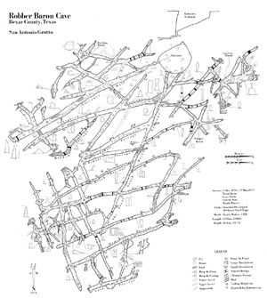
Nor is this effect limited to man-made structures. Consider, for example, this map of Robber Baron Cave, complete with hidden passages (click for a larger image):
It’s complex to the point of being virtually ungameable. (Although I take that as a challenge even as I type it.)
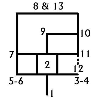
SIZE: My decidedly non-palatial house also makes the point that dungeons don’t have to be large in order to take advantage of xandering. For example, the map I designed for Darkwoods’ Secret only featured a dozen locations, but the flow of the dungeon looks like this:

This smaller scale actually highlights the gameplay impact of non-linear dungeon designs. It becomes very easy to see the many different ways in which the dungeon can be played: Can certain dangers be avoided? Will the PCs or the monsters determine the field of engagement? Where will reinforcements be coming from? What viable lines of defense can be held?
BEWARE THE SPRAWL: None of this, however, is to say that you should never use branching paths or create chokepoints for accessing the lower levels of the dungeon. (Any more than it is to say that every single means of egress should be secret or unusual.) It is merely to say that such features should be used to effect and not simply by default. Variety is the spice of dungeon design, after all.
It’s also important to realize that there really can be too much of a good thing: There is a point at which endless loops and countless connections within the dungeon result in meaningless choice instead of meaningful choice. In xandering your dungeon it’s important to beware this featureless sprawl of ever-looping corridors.
STRUCTURE IN THE DUNGEON: A comprehensive guide to effective dungeon design is beyond the scope of this essay, but there are a couple of useful barometers you can use in the process of xandering.
Difficult vs. Easy: Looking at your map, there should be areas of the dungeon which are difficult to reach and areas which are easy to reach. In saying this, I’m not specifically referring to isolated secret rooms (although there’s nothing wrong with those), but rather with large sections of the dungeon.
In making this assessment you are diagnosing whether you’ve made the dungeon too boring by making the choice of path through the dungeon irrelevant. You want the dungeon to benefit from being interconnected, but if everything in the dungeon trivially connects to everything else then navigation becomes meaningless.
Far vs. Near: Similarly, have the interconnections made your dungeon too shallow? Look at where the PCs will be entering the dungeon. There should be areas of the dungeon which feel far away from these entrances. If everything in the dungeon feels equidistant, break some of those connections or delve a little deeper in your design.
Note that “near” and “easy to reach” portions of the dungeon aren’t problems to be eliminated. What you’re looking for is an effective balance in the mix between all four of these design elements (difficult, easy, far, near).
LANDMARKS: Finally, the complexity of connections within a properly xandered dungeon can also leave the players feeling somewhat adrift. In some cases this can be taken advantage of. In other cases, it’s a problem that needs to be solved.
I started map development by literally copying and pasting a large chunk the Alpha Base ruins into one corner of the map. This established a particularly unique landmark in that corner. These large landmarks in skirmish maps help players immediately know where they are and let them navigate from point to point by in-game visual references. Ideally, each “corner” of any skirmish map is visually unique, and this was my design goal with Terminal Moraine.
Jennell Jaquays – Terminal Moraine Design Notes
Different context, but Jaquays provides the solution once again. In order to successfully navigate a dungeon, the players will need distinct, memorable landmarks to orient themselves.
If you’re designing a dungeon with lots of unique, interesting features, this problem will generally take care of itself: The players will glom on to whatever details particularly resonate with them, and use those details to guide themselves. On the other hand, it can never hurt to do another quick pass on your design and add in a few deliberate landmarks: A large bloodstain. A unique statue. A room of strange runes.
Of course, players may also provide their own landmarks: “Hey, it’s that ogre we killed last week. Awesome.”
On the other hand, you may also be able to use landmarks to mess with your players. Some landmarks could easily disappear. (An ogre’s corpse that gets dragged away by scavengers.) Those unreliable landmarks then open the question of how a missing landmark should be interpreted. (The runes are missing. Does that mean we’re in a different room? Or have the runes vanished?) And some landmarks which might seem unique could easily prove otherwise. (There’s the golden statue of a cyclops in a hexagonal room… but I thought that was on the other side of the complex. Did we get turned around?)
To flip it around one last time, particularly crafty DMs might be able to hide reliable navigation information into seemingly unreliable landmarks.


ARCHIVED HALOSCAN COMMENTS
Garwain
Regarding landmarks, I have the following point to add. A believable dungeon should be practical enough to be inhabited. This is achieved if there is also a timeline connected.
Hall A used to be the throneroom for the Dark Dwarves, but after the ant infestation, the stone throne remains, but the silk carpet was removed to the main corridor to clog an airvent. And when the Orcs eradicated the ants they chopped of the valueble gems from the throne and hid that in their lair.
That kind of detail makes navigating in a dungeon more logical.
Monday, October 24, 2011, 9:05:41 AM
Swordsman
That caverns map is reminiscent of Ken Rolston’s marvelous map from The Black Broo of Dyskund, a Runequest scenario from a White Dwarf in the mid-80s, later reworked in the Shadows on the Borderland adventure pack. I should be running a version of that adventure soon, and I think that map of Robber Baron cave may show up in a subsequent adventure of my own…
Wednesday, July 28, 2010, 6:13:42 PM
[…] С оригиналом Вы можете ознакомиться здесь […]
[…] final change, not a [xandering]: The Cerulean Pharaoh. In what I suspect was an effort to make the module not just “fight […]
While I found your dissertation of greath help, and it will surely impact positively in my future planning of dungeons (and maps in general), I must admit that I can’t understand the “Melan diagram” notation you are using… are the lines corridors, or walls? Are the squares representation of rooms, or corridor loops? What do the double parallel lines mean??
I’ve tried comparing the diagrams in the next 2 parts of the article to the “actual” maps, but I totally failed at finding the needed corrispondences.
A search for “Melan diagram” on Google did not help. Would you be so kind to provide some additionl informations? I feel that this lack of understanding greathly impedes my ability to apreciate the example changes you made on “Keep of the Shadowfell”, and learning about this notation convention would be of greath help for my personal planning.
Thank you!!
Melan discusses his method here, which is also linked in Part 1 of the series. The basic idea is that they’re path-based, but strip out the “noise”. Here’s a fairly basic breakdown:
1. Imagine drawing a single line through the dungeon, representing every path you can take through the dungeon.
2. Straighten the lines by removing all turns. Any intersection will generally be simplified with a 90-degree line.
3. Eliminate any spurs that consist of a single room (i.e., if you were mapping a typical hotel hallway — one hall with lots of doors leading to single rooms — that would appear as a single straight line on the diagram).
4. Double lines indicate level breaks. (From a pure pathing standpoint this is largely irrelevant, but can aid comprehension of larger diagrams.)
Having discovered all of these posts just recently, I decided to attempt Melan diagrams of all the maps in Tales from the Yawning Portal, as an exercise to understand them better.
I gave up on the Doomvault from Dead in Thay pretty quickly, but it was shaping up to bear a striking resemblance to Robber Baron Cave. Not having played or run that particular scenario, I would speculate that it gets around your “virtually ungameable” concerns by dint of the fact that PCs aren’t really expected to navigate it in the traditional way, just to have a sense of each “zone,” which they then travel between more and more via teleportation.
I may just be misunderstanding the goals of that book’s cartography, however. There are several other maps, including much of Against the Giants, which are similarly amorphous, with the PCs mostly limited by monsters and absolute distance rather than walls or other obstacles. The most confusing moment for me was realizing there is a frost giant guarding the entry to a passage which leads halfway along the map to… the far end of the chamber his room started from.