Pit traps are as old as the game itself, and their iconography is familiar to anyone who’s spent time gazing at dungeon maps. A little less familiar, perhaps, is the symbol for an open pit, but it’s not exactly a stranger to the dungeon, either.


If you’re in need of a circular pit, it’s pretty easy to modify these familiar symbols to suit:

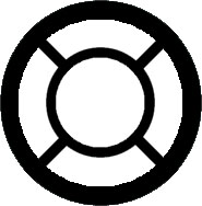
This leads us pretty comfortably to a discussion of trapdoors which are designed to be traversed (usually taking you to another level of the complex). These, too, have an established iconography:


With “C” indicating a trapdoor in the ceiling and “F” indicating a trapdoor in the floor.
But here things get a little confused, because you will also find some maps keying the “C” to mean “concealed trapdoor”. (Which matches the use of “C” to indicate concealed doors in general.) This matches the use of an “S” to consistently mean both “secret trapdoor” and “secret door”:
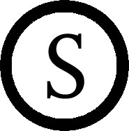
So what I’m going to suggest is that our map symbols for trapdoors instead look like this:

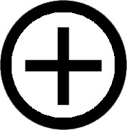
And it’s now relatively simple to use “S+”, for example, to indicate a secret trapdoor going up. Or even a +/- to indicate trapdoors in both the floor and ceiling at the same spot.
The other argument for this is that it conveniently matches the UIS’s key for indicating the difference between pits in the floor and chimneys in the ceiling:
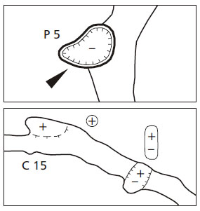
Which looks pretty useful to me.
Final thought: Would it be useful to indicate the depth of a pit?
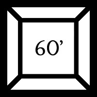
The meaning seems fairly clear, but it might be muddier if we were dealing with a closed pit. What if we invert our symbol for ceiling height and use it to indicate depth?
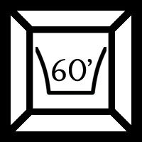
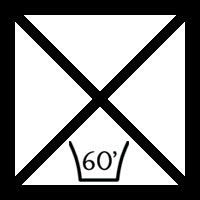
It looks perhaps a trifle redundant on the open pit, but I’m guessing the consistency of iconography is worth it. Particularly since this same design can be used for pits and chimneys as desired.
And as a bonus, here’s a thought on indicating a spiked pit:

What other common features do pits have that it might be useful to include on the map?
This post is part of the RPG Blog Carnival for Cartography.




As someone for whom mapping is inexplicably an ordeal, I’d like to thank you for posting this sort of thing. I find it very useful.
What about a secret door along the shaft of a pit? Or at the bottom. This once was common, but maybe due to difficulty mapping it, it not so common anymore.
Also, self-closing pit traps vs one-use pits.
How ’bout a symbol for “when you fall down this hole you land on soft cushions and are afterward greeted by happy puppies”? Probably that kind of pit could use a lot of playtesting as well ;).
I have always wanted too know if the pit is actually built into the floor is just weak sticks or planks and underneath some camouflage like dirt or something but basicly I guess weather it is, 1 self closing 2 close-able or 3 one use only.
I think the one-use vs. reusable thing is something that should be in the dungeon notes, since that’s where most trap information is kept. Same with the secret door at the bottom of the pit (or the side if you’re really devious). Not everything can be symbology, mainly because, as it stands, that depth marker on the closed pits is pretty darned small, and would be nearly impossible to see if it was a five-foot pit trap on a quad-ruled grid.
I find Jacqueline’s comment most pertinent. I think “soft cushions” and “friendly happy puppies” is an aspect that has been lost in modern gaming and should be explored in depth.
I think that adventurers who don’t recognize hell hound pups deserve the roasting they get when the enraged pack arrives.
I’m with Sir Wulf on this one. Pardon me while I jot down a few notes.
Great series of articles. One note: am I the only one to think that the last picture looks like a label with washing and ironing instructions?
Good idea to pillage actual caving iconography. I am concerned that some of the pit icons won’t read clearly when the pit fills an actual 10′ square, though.
I’m astounded by this entire series but I have to say that this one in particular blew my mind. I will be utilizing these symbols from now on, especially the depth and spike indicators. I can’t tell you how many times I’ve forgotten those in the middle of a combat and had to wing it only to realize the reason combat isn’t as difficult as I thought was because I had nerfed the pit.
Keep the ceiling height icon the right way up to denote the height of a chimney instead of the depth of a pit. For light why not have three icons: a little flame to mean candle light, a four point star for a lantern or something similar and the star burst for bright lights with big radius.
As well as spiked pits, what about water, flame, gas filled?
As a professional fantasy cartographer (I can say that now as I’ve done 3 commissions and am currently working on my fourth) I’m really enjoying this series, particularly as my focus/expertise is OSR style dungeon maps. So far I’ve stuck with the “standard” iconography for trap doors, pits and so on (as well as doors and stairs). Your suggestions are very interesting, however, a lot depends on the scale the map will be printed. If printing at battle mat size, i.e. 1 sq = 1″ (25mm), I think your revised symbols would work fine, the only drawback being the players would see them…
My work to date has been published at 1/2 page size (letter/A4), so in a busy dungeon that detail would most likely be lost. So while it would be nice to show this level of detail on the GM’s map it is often not practical. Room/corridor descriptions should be written to convey this information in a clear and concise manner. GM’s can always print maps at larger scales and notate them using your various systems.
I don’t think it’s obvious that “+” would bring you up. My first thought was that a “+” brings you to the next higher-numbered dungeon level, which is usually deeper into the ground. So I don’t find it intuitive, but at least it matches caving maps IRL.
Anyway, I thought you established that the best practice is that you label it with it’s destination? Instead of “-” you indicate that it goes to level 2 room 5, or whatever.