One of my goals with this series of brainstorming posts is to find ways to encode as much data as possible onto the dungeon map itself. This is partly to supplement the map key, but it’s also about removing some types of information from the map key in order to make the key itself easier to use.
One example of that would be ceiling height. Although this information is often forgotten about entirely (which becomes increasingly problematic as the PCs start levitating and flying), if it were to be habitually included in the key it would become an extra bit of clutter to parse.
On the dungeon map, however, I think it adds clarity and can be easily referenced. Assuming, of course, that we have a clear method for doing it.
On cave maps, differences in elevation and height will often be indicated by simply listing numbers. For gaming maps, however, I’ve found that this approach – mixed with a numbered room key – often results in a confusing map. Different font sizes and/or text colors can aid in comprehension, but the layout still often comes across as fairly muddy to me.
Consider this solution adapted from Aeons & Auguries, however:
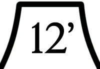
The symbol clearly sets off the number and allows quick identification for what this number (in a potential myriad of others) is referring to.
More generally, if we combine this with our symbol for light sources, I would argue that we have the basic workings for giving each room a “detail legend”. Let’s try it out:
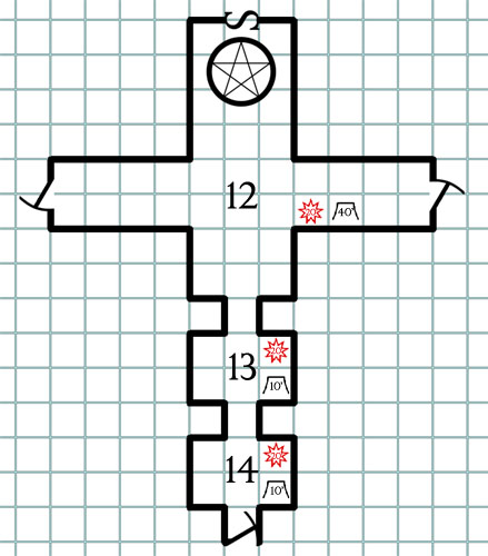
Probably needs some tweaking on the starburst symbol in either size, design, or font to make it more legible. But the basic principles seem pretty sound and easy to read: At a glance I can tell that all three rooms are lit with candle-strength lights (20′ radius), while the ceiling in area 12 rises to a high vault 40′ above the heroes’ heads.
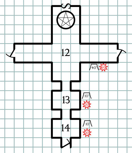
If the map allows, it would probably also be pretty easy to place the detail legend for a room next to the room, possibly with some kind of grouping iconography to make it clear which room the legend belongs to:
CEILING FORMS
What about unusual ceiling shapes? any way to get those on the map?
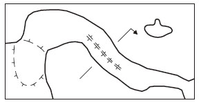
Here’s how the UIS keys ceiling forms for cave maps:
We could probably use a simple version of the same, keying from our ceiling height legend:
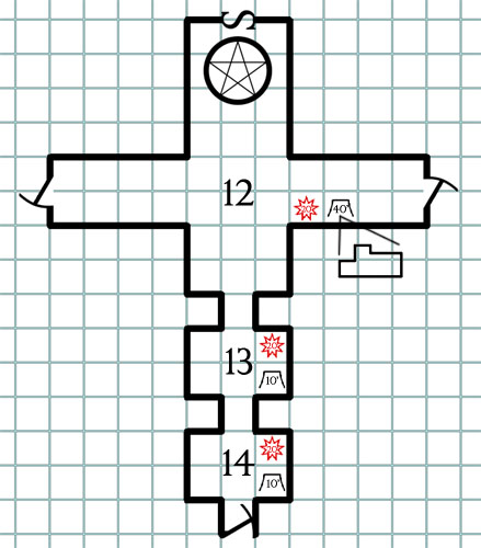
Not something you need for every room, but potentially useful for when those sorts of details become important.
Go to Part 5: Pit and Chimneys
This post is part of the RPG Blog Carnival for Cartography.





We’re getting deep into the question that really forms the heart of the problem of mod-making:
“What information is important?”
What I find particularly interesting is that some aspects of a dungeon/room/whatever are just assumed to be important, while others are almost always ignored. Consider the following: Room A is a large dining hall for this particular hobgoblin tribe. There is an adjoining kitchen, which we will label room B. Is it more important for purposes of running an adventure to know exactly how large room A is, or exactly how much noise the PCs will have to make to attract the attention of the Cook and his helpers in room B? The former piece of information is always present. The latter piece of information is one that I have never seen provided in a module. Maybe that’s the right choice, but I think it’s high time someone took a good second look.
So kudos to you, Mr Alexander. I hope you carry this series for a while. It has given me a lot to think about.
I’d try a black number inside the red starburst 🙂
I agree that the A&A symbology is easily interpreted as meaning “height”, but
the final suggestion is really ambiguous. Which part of the room has the mid-height ceiling, the wing to the east, or the wing to the north with the pentagram? I think a key feature of the UIS convention is that the transect line shows how the cross-section relates to the plan view.
My natural inclination is to read icons outside the room as being about the room in general, and icons inside the room as being specific features. The lighting starbursts, in particular, look to me like they’re indicating the placement of a single light source for each room when they’re inside.
How much do lighting and ceiling height vary in your dungeons? It could get a bit cluttered if you’re marking every single room, but I think these are very good conventions for noting deviations from the default. Maybe every map needs a “room defaults” up in the corner?
@Migellito: Yup. Black numbers in the red is definitely the way to go for legibility. Thanks!
Based on Sasha’s point, a “DC XX” placed inside an eye shape would act as an easy way for gamemasters to see the result needed to sneak past an area. Alternatively, stylized eye or ear shapes could cue GMs when there’s something important that the PCs may see or hear in a location.
In Harn the height of the ceiling is simply a number with a line over it. If there is a slope then the line is similarly angled. In all my years of gaming I’ve found the Harn maps to be the pinnacle of detail and logical notation.
The ceiling shape doesn’t really work for me. I’ve used the angled/arched lines, or for really complex shapes consider having multiple ceiling heights in the same room.
I did accommodate ceiling heights in my scheme but on reflection this is maybe one thing that is best left in the key notes. There is the temptation to load everything about a room on a map, but then that risks breaking down when you design small rooms, rooms in a building without rock space next to them, and so on. Map itself is best used to show exact locations of things where important, and to keep the mind aware of adjacent features the players should know about.