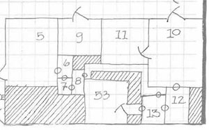
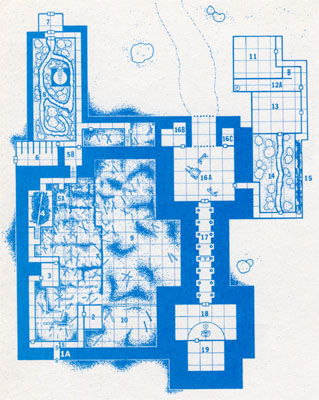
Over the past 30 years or so, there’s really no question that dungeon maps have become prettier. For example, here’s part of the map from A1 Slave Pits of the Undercity (published in 1980):
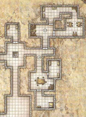
And here’s a similar map from 2008’s Keep on the Shadowfell:
The fancier textures certainly look very nice. And they may tell you a little bit more about what you’re looking at. (The tables are made of wood, for example.) But for the most part, the utility of the map from Keep on the Shadowfell is essentially unchanged from the utility of the simpler maps from two or three decades earlier.
One of the ways in which “pretty” could be turned into functional utility, of course, is if the maps were offered in a format and size at which they could be easily turned into battlemaps and displayed on the table for the players to appreciate and interact with.
But setting that aside, how else could we improve the utility of our dungeon maps? Or, to put it another way, what information could we be coding onto our dungeon maps to make them more useful?
Let’s start with doors.
OPENING DOORS
The humble door:
![]()
I don’t know about you, but one of the first things my players want to know when they come to a closed door is: Which way does it open? They want to know if they can get access to the hinges or if they’re going to need to bash it down.
And does it open to the left or right? If people decide to start peeking through it or want to brace it against a nearby wall, these become important issues.
Naturally one can just make a judgment call. But how nice would it be to have this information encoded on the map? (If for no other reason than to make sure it opens the same way when the PCs come back.) It seems like it would be pretty easy.
Ironically, the first module ever published for D&D included this information on the map. Here’s a sample from The Palace of the Vampire Queen, published by Wee Warriors in 1976:

(The circles represent secret or concealed doors.)
So, that’s one option:

We could also simplify that design by removing the swinging arc to leave a simple open angle:

Another option, recently proposed, is Roger’s “Elvis Door“:

I’ll be honest that I’m not much of a fan of the Elvis Door, largely because nothing about it intuitively says “door” to me. And even after staring at it for awhile, I’m not entirely sure I’m reading it correctly. For example, when I look at it in actual practice (on a map designed by Telecanter), I keep trying to read the slant as indicating that the door is being pushed on the slanted side (which I’m fairly certain is actually the exact opposite of what the symbol is supposed to be communicating).
One last option, a simple arrow:

This symbol has the disadvantage of only indicating the direction of the door and not its direction of swing. (Although it might be useful for a door that actually swings up like a garage door.
What are your thoughts? Which symbol (or symbols) seem to intuitively make the most sense to you?
For my mileage, I’m increasingly liking the doors from Palace of the Vampire Queen. I was initially skeptical of the extra arc line, but I’ve found that in actual practice this makes it much easier to use the maps. (Without the arcs, the simple angling line tends to simply “fade” into the rest of the map and disappear.)
This post is part of the RPG Blog Carnival for Cartography.


I like the elvis door, but I think I’ll stay with the boxes. And the understatement, that doors always open into the bigger room and are hinged on the right, if you look from the bigger place. *shrug* If there are really two rooms of exactly the same space roll randomly.
I tend to use option 1. The arc is easy and quick.
I much prefer option 1. Some time years ago I made a long key with about 20 options, your option 1 is a standard closed door, option 2 is a standard door left open. I also had symbols for barred, locked, stuck, iron, one way, etc. I’ll scan them some time if I get a chance.
I’m partial to option one. Alternatively, I draw the arc and mark the ‘door’ in pencil (we use grid paper flipcharts). That way I can indicate the door is open or closed as the situation changes.
As an aside, some thoughts on door swing:
In a modern setting, doors should typically open ‘toward the outside.’ That is, when standing in a room, plot a course to the exterior of a building and always have the doors open out; this is to facilitate evacuations (such as for fires). There are exceptions to this, such as apartment doors and doors on narrow hallways: Opening out means you could hit a person walking in the hallway. Bathrooms also open into the room.
If you’re not in a modern setting (or a location with an appreciation for fire codes), have doors open into the room you would be entering. The idea is that you can’t hit a person walking toward the room with a door. Remember, aside from a large dining room or hallways, older homes didn’t have suites of rooms unless they were private, and you didn’t expect traffic in your private rooms. Even then, dining halls with doors would (as they’d be in richer people’s homes) have servents operating the doors (and could safely open into a hallway), or they’d be pocket doors (in which case swing is not a problem). Servent doors will always benefit the employer and thereby open into servent areas.
The easiest solution is to mainly have rooms branching from hallways, rather than from other rooms.
I generally use the square. I find that being able to picture the material of the door is more important to me than the direction it opens, which I can determine based on the square’s coloration. To keep that tidbit of information using the arcs I’d have to draw the standard square in the arc everytime I wanted a door on the map, which seems more of a hassle than it’s worth to me.
A little rule of thumb I use is that doors generally open outwards from rooms to corridors, or from smaller rooms to larger ones.
I’ll indictae where the hinges on the door are, as players often ask where they are when trying to force their way into a pesky door. It’s not a perfect solution but doors generally open towards the side the hinges are on.
I’ve got a fairly comprehensive door chart for lot’s of door data
http://aeonsnaugauries.blogspot.com/2010/02/door-legend.html
That chart is pretty awesome.
I then went poking through your “maps” tag. People should also check out your post on tactile maps.
Regarding this post on using hexes for indoor maps: What happens if you align the right angles and walls to the center points of the hexes? Using that method all you’d need is a reliable guideline for handling half-hexes and it seems like you’d basically be good to go.
Well, I’ve looked through both the “Elvis Door” article, and the aforementioned “door chart” linke din J.D. Jarvis’ comment, and I think that J.D.’s chart is a good start, though I’d use slightly different textures for the composition, and slightly thicker lines for the extra information (sigils, signs, barred, trapped, etc.), but that’s more of a formatting issue than a design issue.
Also, Mark talked about location of the hinges (inner vs. outer, left vs. right) on doors, in regards to fire codes in modern times especially. In most of my home games, we either call a door an “OSHA” door, or a “non-OSHA” door, in that “OSHA” doors always open out of the rooms, facilitating evacuation (an outer hinge door). These outer hinge doors are easier to think open (pop the hinges) as opposed to muscle open (kick in the door).
As for a universal rule, in my opinion, doors should open away from the entrance (into rooms), facilitating barring and other reinforcements, and keeping the hinges inside the room. Doors should be hinged towards the nearest corner, or if in the middle of the wall, the latch should be on the dominant hand side when walking into a room. Secure rooms (cells for instance) should tend towards sliding rather than hinged doors.
I tend to use a bar straight out from the doorway in the direction that it opens, and then draw the arc from that. If it closes, I just set a cutout of the room with it shut on top, and remove it if opened.
What is gained by adding this information onto the map?
The only sort of situation I can see this being a factor is when a player asks which way the door opens.
In that case there are two actions, either:
the DM makes a call and just says it’s one way or the other
OR
The game stops as he references the map and room key to try and figure it out
@-C: You’re right, it only becomes useful at those times when the information is needed at the gaming table… But, on the other hand, that’s true of pretty much everything in scenario design.
It’s also true that the GM could just make a judgment call. That’s what I do with most pre-published adventures. But that does mean that I now need to somehow keep track of that information (often across multiple sessions) in order to keep things consistent. (And there have, in fact, been several occasions on which a player has said, “Didn’t that door open the other way last time?” And they’ve probably been right as often as not.)
OTOH, glancing at the map which you have lying in front of you is pretty quick and easy.
I also have problem intuiting the Elvis door. Option 1 or 2 is how I always draw them when I need door opening direction recorded. And that is how blueprints I’ve seen do ’em after all; http://carnationconstruction.com/images/Blueprints00StructureDoorsWindowsEtc.jpg
I used to use either the angled door or angled door and arc, but when I started mapping again a couple of years ago I purposefully switched to using the standard map icons set from the 1981 Basic Rulebook as my guide.
I’ve been using the angled door and arc for a while now. I picked it up from friends studying architecture in college, and it just seemed like a better way to indicate doors all around.
In designing my megadungeon, I’ve gone with elvis doors, mainly because I also want to communicate
A) if the door is locked
B) if the door is stuck
In addition to the direction it swings. I notetate on the outside with a + if the door is trapped, and a w if the door is wizardlocked. I note the lock type (i.e. Kerr Double smooth pin 6:BPPU) or trap (poison needle, THAC0 16 save or 2d4 damage, 8:BBRPU) on the key.
Sorry for the double post.
I indicate that the door is locked using an arch within the square door part (looking like the arch of a padlock) and if it’s stuck by a solid semicircle on the side that opens.
[…] С оригиналом статьи Вы можете ознакомиться здесь. […]
Why not just draw an arrow diagonally out of the door to show which way it opens and which way it swings?
You know on the last option you could always move that arrow to one side of the door and it would indicate which sides swings. Option 1 is sort of the standard in architecture so I go with that one.
I dont think theres a need to invent new graphic nomenclature for doors, stairs, etc.
Architects solved this same problems long ago, and there are many symbol systems to note this kind of things in maps, including the opening direction of doors, upward/downward stairs, and many other hazards.
https://stock.adobe.com/ee/search?k=floor+plan+icons
I’m struggling to see how an Elvis door could be misread (*obviously* the door hinges are at the narrow point of the triangle, and the door opens in the direction the triangle projects). Can somebody explain that one to me? I’m mostly just curious.
@Mouse: Because neither end of the slanted portion is where a door hinge would actually be, it’s possible to interpret either end of the slanted line as being the hinge.
The triangle either shows the space the door is swinging into when opened. Or the “indented” portion of the door indicates where the door is pushed, swinging the opposite direction.
Whichever interpretation you see seems “obvious,” but won’t actually communicate clearly to others.