Light can be seen at great distances, which means that what a PC can actually see will often be determined by lights sources in a dozen different locations. When those light sources are only referenced in the location keys, it becomes almost trivial for errors to be made.
Player: Okay, we head through the arch.
GM: The arch leads to a vaulted chamber perhaps forty feet long lit with an eery red light which glistens off the blood streaming down the walls. The light seems to be pulsing from a glowing heart which hovers in the middle of the chamber.
Player: Man, I feel like we probably should have noticed that during the half hour we spent searching the room right next door.
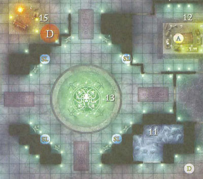
Some modern maps will take advantage of their “photo realistic” appearance to denote illumination or light sources. For an extreme example, here’s a sample from Fane of the Drow (a product from what I refer to as the Effervescent Period of WotC cartography):
But I’ve struggle to find a method that can be used with perfect clarity, particularly when it comes to more utilitarian maps. (Like those that you would draw for yourself.)
Roger the GS, however, has recently proposed using a red starburst symbol. The resolution on his reference document was a little low for my use, so I’ve re-engineered it:
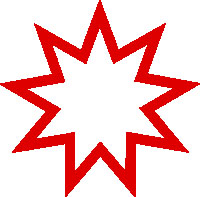
I like this symbol a lot. It’s simple, intuitive, and universal in its form. It doesn’t necessarily require the color-coding, but certainly benefits from it.
But let’s take a moment to consider the best way to use the symbol. For example we could use small versions of the symbol to indicate every light source, as shown in this map of a long hallway lit by sconces:
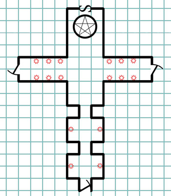
This has a lot of obvious utility, but could also very quickly lead to unnecessarily cluttered maps.
Another option would be to use a solitary symbol to mean “there’s a light source in this room”:
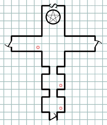
Less information being conveyed, but also less clutter.
A third option would be to use a slightly larger symbol to encode the size of the light source (as measured in its radius of illumination). The size require for legible digits makes this a poor fit for “every source of illumination”, but it combines well with the “one symbol per room” method:
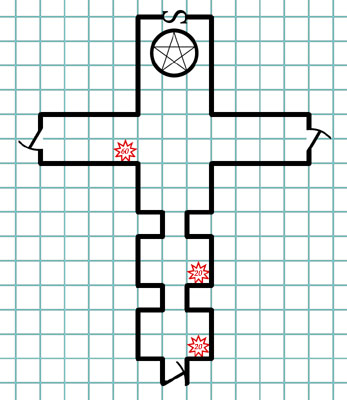
Thoughts? Which method seems most useful to you?
This post is part of the RPG Blog Carnival for Cartography.





I like the third option. I think it has the most utilitarian nature of all of them. The first option speaks to my desire to know where everything is placed, but that’s what map notes are for.
Another method I’ve used is coloring in the maps with crayons for myself. Denoting light sources and how far they are visible becomes simple with this method and makes them look better. Plus there’s something rewarding about coloring a map, even if I’m the only one to see it.
Something that I’ve been thinking about as well as regards light sources is the concept of light diffraction and how that affects Perception and Stealth. In an area that’s entirely illuminated, it doesn’t make much difference, but when there’s a single source of illumination, such as a brazier or a torch being carried, the difference between low-light and full light becomes important when I’m trying to ambush my players.
If the room is fully illuminated, I would probably go with option #2. I’m going to need to check the notes to answer questions like “What color is the light under the door?” anyway, and option #2 contains all of the information that I need to start that conversation. (i.e. – “You can see that the next room is brightly lit.”)
On the other hand, if a room is only partially lit, then I would use option #1 for light sources of standard strength, and a combination of option #1 and option #3 for light sources of unusual strength. Whether standard is a torch or a sunrod would probably be defined by context. Personally, I prefer torches, but I can see using either standard.
I think Sashas has a good idea. Use the light source indicators for standard light sources, but the larger one for the unusual light sources.
Perhaps you could make the red starburst a standard light source indicator, and have the number of points correspond to the range (a trigram for ≤15 feet, a quadgram for ≤20, a pentagram for ≤25, a hexagram ≤30, a septagram for ≤35, an octogram for ≤40, and the nonogram with a number for >40 light sources).
I’m thinking, when we are using colorcoding, we might as well just make it a red circle. Makes it much easier to draw on hand-drawn maps. The number could also denote number of squares, rather than feet. That will make it a single-digit number most of the time, and make it easier to see if it reaches the corridor 3 squares away with any (admittedly easy) calculations needed.
I’m considering whether one might want to simply show on the map which squares are lighted. On hand-drawn maps you might draw the outer limit of the light. On a computer-drawn map you might color all the lighted squares. Would let you know with a glance whether the light is visible in the corridor, and how close the thief can sneak while hiding in shadows.
Considering that finding an operating source of light in a dungeon is probably a significant event (especially if one is running a mega-dungeon), I am in favor of marking every such source. The ranges in the Wotc example are unnecessary clutter, as light rules are clear, but the sources should not be relegated to footnotes or keys.
To make an architechtural comparison: would you draw a house, and then instead of drawing where every light bulb, switch, and outlet goes, simply put a light bulb icon in the corner of each room with a footnote at the bottom with verbage detailing where each of those items belongs? Of course not, it would be unreadable, and I think that rule should apply here.
However, I dislike the red star things. They look like explosions to me. I would use a tiny candle flame icon.
I like the third option the most, but I also think it needs a better way to convey the direction the light is coming from. In the wide room, marking each torch shows exactly how the light falls. Marking, say, one at each end would give the same ‘light from each side’ message, but still with not much clutter.
The symbol is a bit fine for hand drawn maps like I use, but I’m sure I can work something out.
I prefer option 3 as it presents the most information with clarity. However, let’s think about this in reverse.
Do I really worry about where there is assumed light? No. There is just the assumption in play that everyone can see and thus all combatants/explorers are acting with full efficiency.
However, what I really need to know is where there is natural darkness or dim light or whatever exception there is (depending on system and how it deals with illumination). What are the squares that I can assume are dark unless the PCs are using their own light source? A small black dot on such squares in conjunction with given light sources and the red circle with number would seem a good solution when you have pockets of darkness.
Best Regards
Herremann the Wise
@Herremann: That’s a good point. The most useful notation will be the unusual: If the complex is assumed to generally be dark, then light is notable. If light is typical, then darkness needs to be noted.
I’ve always just drawn little torches, lanterns, braziers, or whatever else on my map. I’m not worried about a cluttered map; the more detailed it is, the more lively and expressive my descriptions become. On the other hand, a nearly blank map with nothing but walls and doors drawn on it dulls my creative impulse at the table.
Of course that’s what map notes are for… but I don’t like map notes. I don’t like shuffling through papers or flipping through pages when my players ask me a question. That slows down the game and subtly disencourages questions. I much prefer to have everything I need written/drawn on the one piece of paper with the map.
Very useful and well written articles. I’m going to use your suggestions in my next game session.
Anyway, I wonder how your sample dungeon grid are drawn.
Thank you
I’d like to see a simple icon for each light source and maybe some sort of radius arc that resembles the “pool” of light cast.
Maybe that’s too detailed, but I’m just imagining a Thief wanting to slip in the shadows and around the light sources, and maybe even dowsing light sources to create pockets of darkness.
@Hautamki: I’m definitely looking to encode as much information onto the map as possible. I consider map keys essential, but also feel the less you need to look at ’em, the better.
@Gennaro: The maps are being put together in Dundjinni with some minor finishing touches (mostly text) in Photoshop.
Dundjinni is fantastic: With the base program and the Classics icon pack, I can create maps on the computer at pretty much the exact same speed I can draw them by hand while getting results that look much, much better than my hand-drawn stuff. (You can also achieve much more impressive results, too.) Dundjinni is basically the only mapping program I’ve used that has given me results which justify the extra time required to use the program.
Unfortunately, Dundjinni’s creators are no longer properly updating or maintaining the program so it can be difficult to get your hands on a copy. And if you’re using newer versions of Windows, then the Classic map pack doesn’t work at all.
So I’ve been slowly creating my own library of Old School icons.
If you always put the burst next to the room key number, there’s less of a temptation to think it shows the literal location of the light.
From my point of view, the reason to have this icon is to remind you of what the characters can see from the next room over, so the actual radius of illumination is something that can maybe be left in the notes for the room itself. The info that would be more useful, if tough to actually depict, would be the intensity (well OK, radius can serve for this), quality and color of the light.
My thought process is that the star is too complex. I think a circle should be used, and if it is a directional light, like a lantern with only one open side, a point can indicate the direction of focus. Color can indicate light color, with black indicating true white. A dot in the center can indicate that the entire room is well lit. A single symbol with no dot means whole room is dimly lit. When using a symbol for each light, the number can indicate one of three things depending on preference: 1) number of feet light illuminates 2) number of squares light illuminates 3) an assigned number indicating the general area of illumination (e.g. 1 for immediate area, 2 for a standard torch, 3 for campfire, 4 for ungodly bright.
John K said:
“would you draw a house, and then instead of drawing where every light bulb, switch, and outlet goes, simply put a light bulb icon in the corner of each room with a footnote at the bottom with verbage detailing where each of those items belongs?”
I had a similar concern. With the symbol, it’s unclear if it means the whole room is lit, or if there’s a light at that location.
I’d put in symbols at each “sconce”, in the room itself, with a “range value” outside (to avoid having to cram in small print numbers; I still draw maps by hand…).
Option 3 doesn’t seem to me like it would work. I could see having a starburst (with or without the radius written inside) for every light source, or having a starburst to specify “this room is brightly illuminated”, but having one starburst with a number in it to represent an unspecified number and location of light sources of radius X just doesn’t work.
Another option would be to use different icons for different standard light sources, maybe a little flame icon for torches, a lign with rays coming off the end for sunrods, and so on. And then the “starburst with number inside” could be a generic symbol for miscellaneous light sources.
Consider this a fashionably late entry into the conversation, but here is my pitch.
I would have two versions of the maps, using the advantage of the color-coding:
The first would have basic light signifiers, like option 2, color-coded to signify the type of lighting in each room, i.e. red for brightly lit, orange for partially lit, blue for partially dark or obscured; and purple for pitch black.
The second would be a detailed, more tactically-minded map. Rooms that are brightly lit or pitch black would be the same, but otherwise would show the individual sources and their ranges, like option 3. The second map would also include your lovely keyed monster icons.