The Alexandrian

Posts tagged ‘maps’

Sample Dungeon Map - The Alexandrian

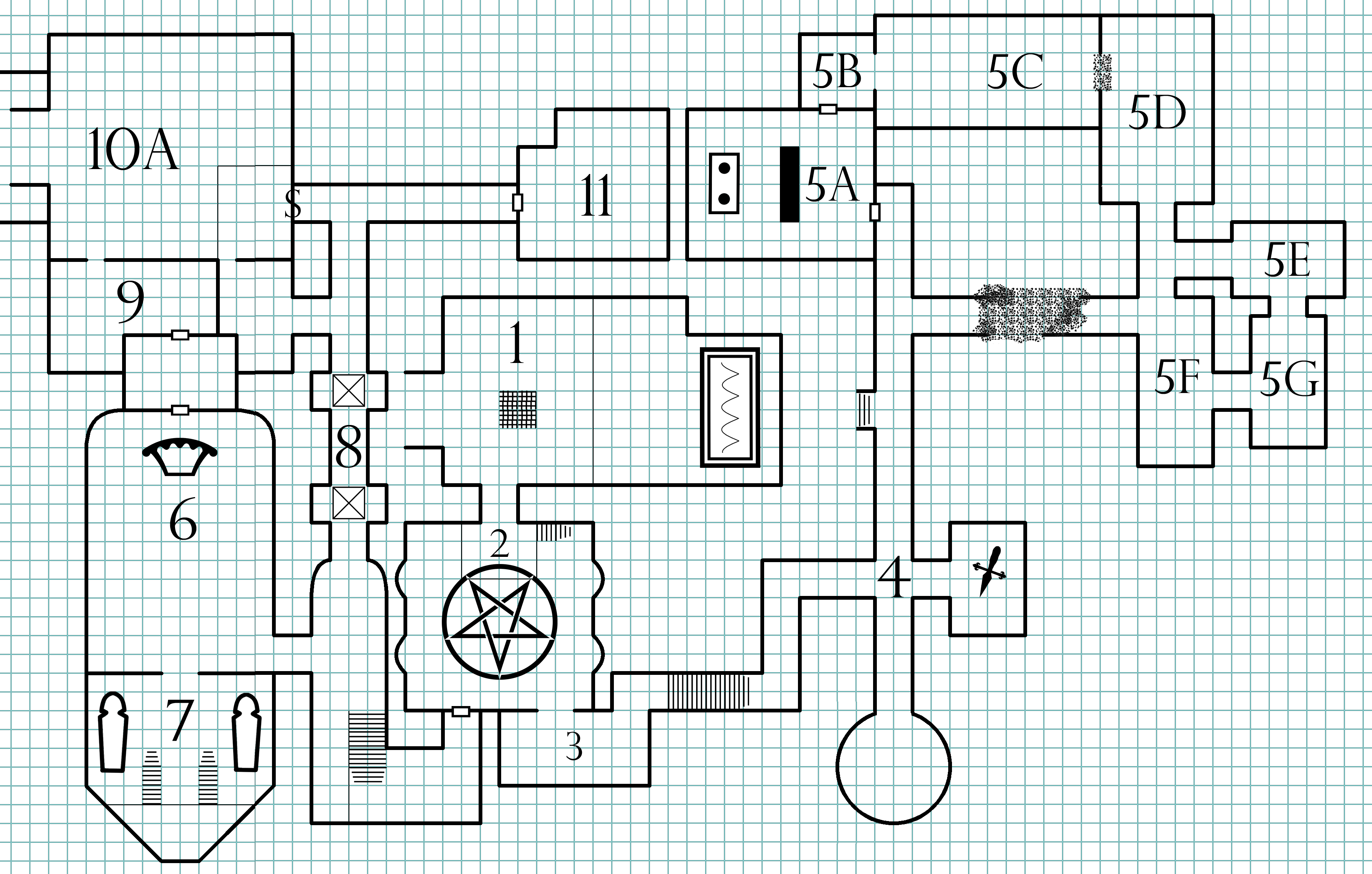
Many moons ago there was a tile-based RPG mapping program called Dundjinni. It had a lot of cool features, but one of the best was the Old School Mapping Pack, which was a tileset that would let you easily replicate old-school style dungeon maps. I really liked it because, unlike a lot of other mapping programs, it was the only one that I could create a map in almost as easily and quickly as sketching it by hand.

Over the years, in addition to using it for my home campaign (as seen in Running the Campaign: The Adventure Not Taken and the map shown above), I used it for a number of projects here at the Alexandrian, including:

The Halls of the Mad Mage

The Strange: Violet Spiral Gambit

The Ruined Temple of Illhan

Better Dungeon Maps

Remixing Keep on the Shadowfell

Xandering the Dungeon

The developers for Dundjinni, unfortunately, vanished into the mists of the internet and the Java-based program slowly started deteriorating. One of the first things to break were the official tilesets, including the Old School Mapping Pack. (If I recall correctly, as an anti-piracy measure, the program would verify the tilesets before loading them, and the website would no longer verify the tileset.) Fortunately, you could still load custom tiles, and so I ended up custom-crafting my own set of old school tiles so that I could continue using the program.

Several years ago, however, the program itself finally stopped working on modern operating systems, and that was it. Fortunately there are newer options like Dungeon Scrawl and Dungeondraft which have picked up the ball Dundjinni dropped and run with it. (And you’ve seen maps from those programs on newer projects here at the Alexandrian.)

A patron of the Alexandrian, however, recently asked if they could get copies of some of my custom old school Dundjinni tiles. I’ve tracked down my old files, packaged them, and you can download the full set at the link below.

The set includes stuff like these custom chairs:

Map symbols depicting four different styles of chairs.

Or, as another example, this sarcophagus, catapult, and cart:
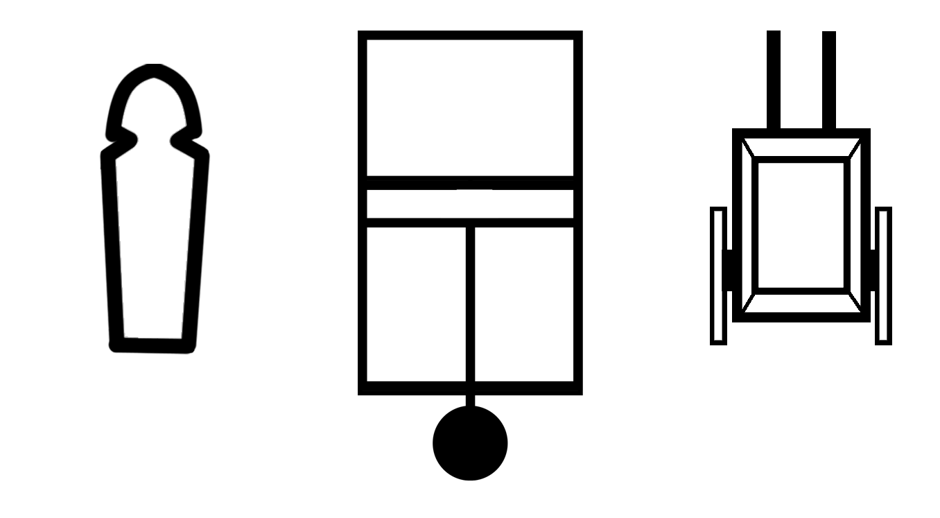
Map symbols for sarcophagus, catapult, cart.

The set also includes the custom symbols I designed for the Better Dungeon Maps series:

Map symbols for pit depth, light source, and monsters.

 And there are many more!

If you still have some old machine running Dundjinni, these tiles are still set up so that you can easily load them as a custom tileset, but you are more likely to find them useful in other mapping and imaging programs. Permission is granted for commercial and non-commercial use (see the included readme file), and if you do find some use for them, I encourage you to come back and share your creations with us, either in the comments here or on the Alexandrian Discord!

ALEXANDRIAN OLD SCHOOL TILESET
(zip file)

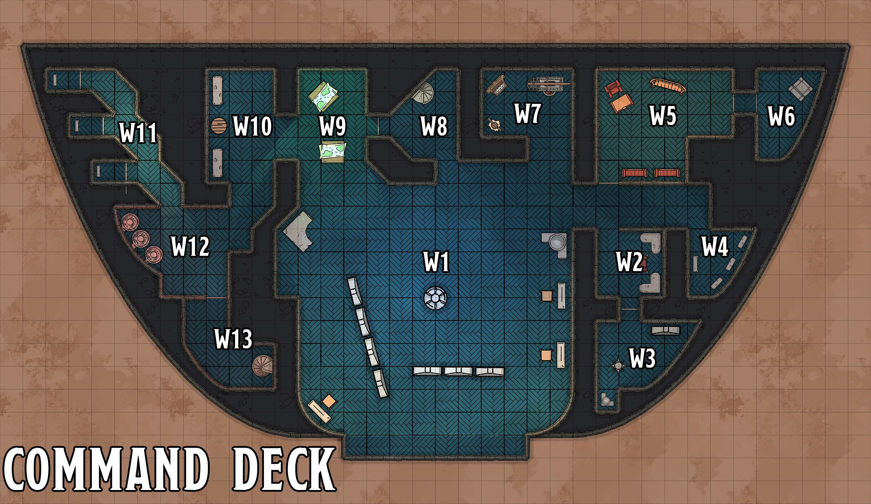
Zariel's Flying Fortress - Command Deck

(click for large map)

This map is designed for use with Part 7D: Raid on the Flying Fortress. You can download a large version without labels for VTT use by clicking the image.

Go to the Avernus Remix

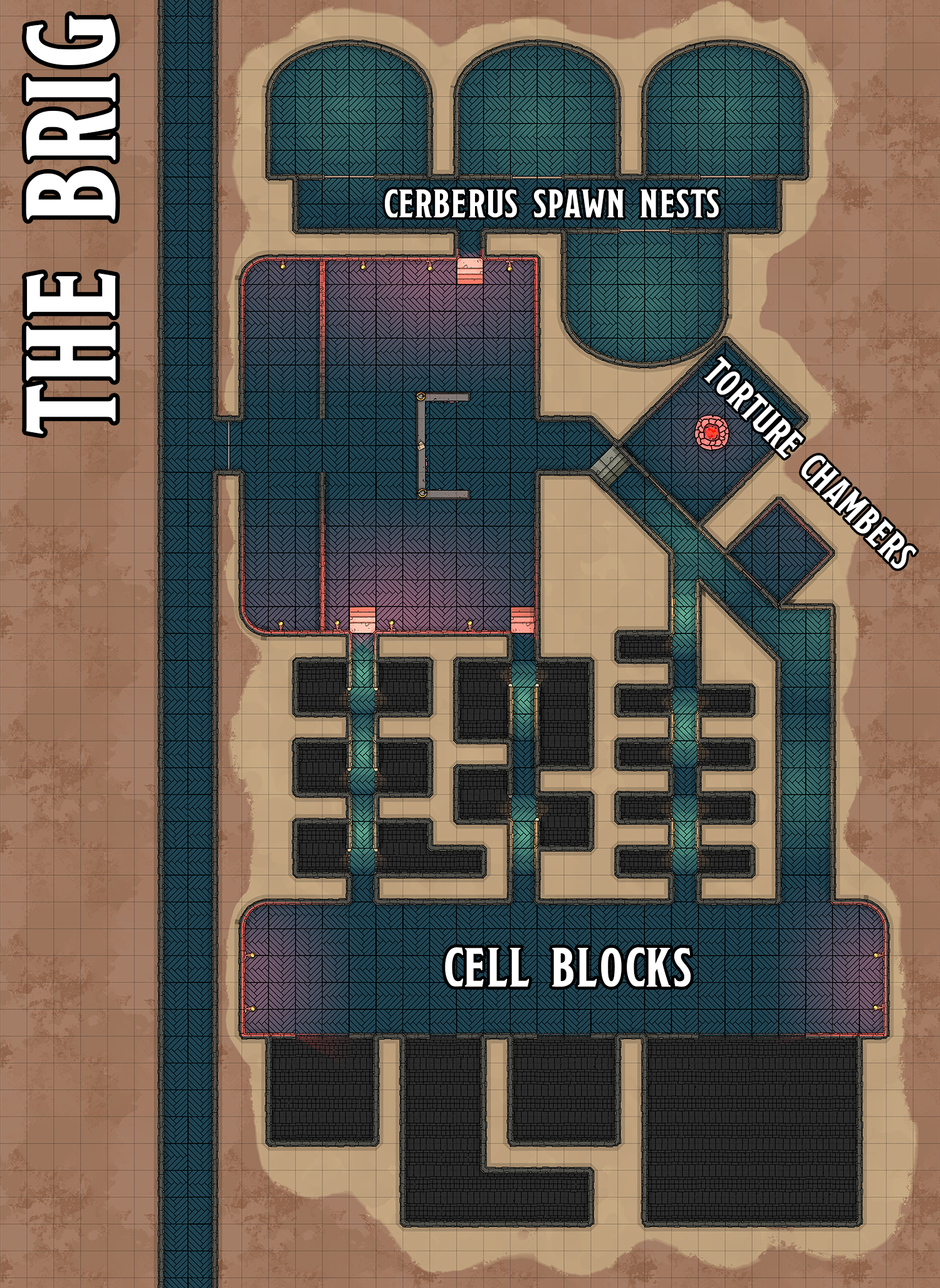
Avernus - Zariel's Flying Fortress - The Brig

(click for large map)

This map is designed for use with Part 7D: Raid on the Flying Fortress. You can download a large version without labels for VTT use by clicking the image.

Go to the Avernus Remix

The Queen’s Gallery at Buckingham Palace has a display of Leonardo da Vinci’s drawings, drawn from a folio collection obtained by Charles II in the 17th century and only made publicly available in the early 20th century.

I saw the exhibit while I was in London last week.

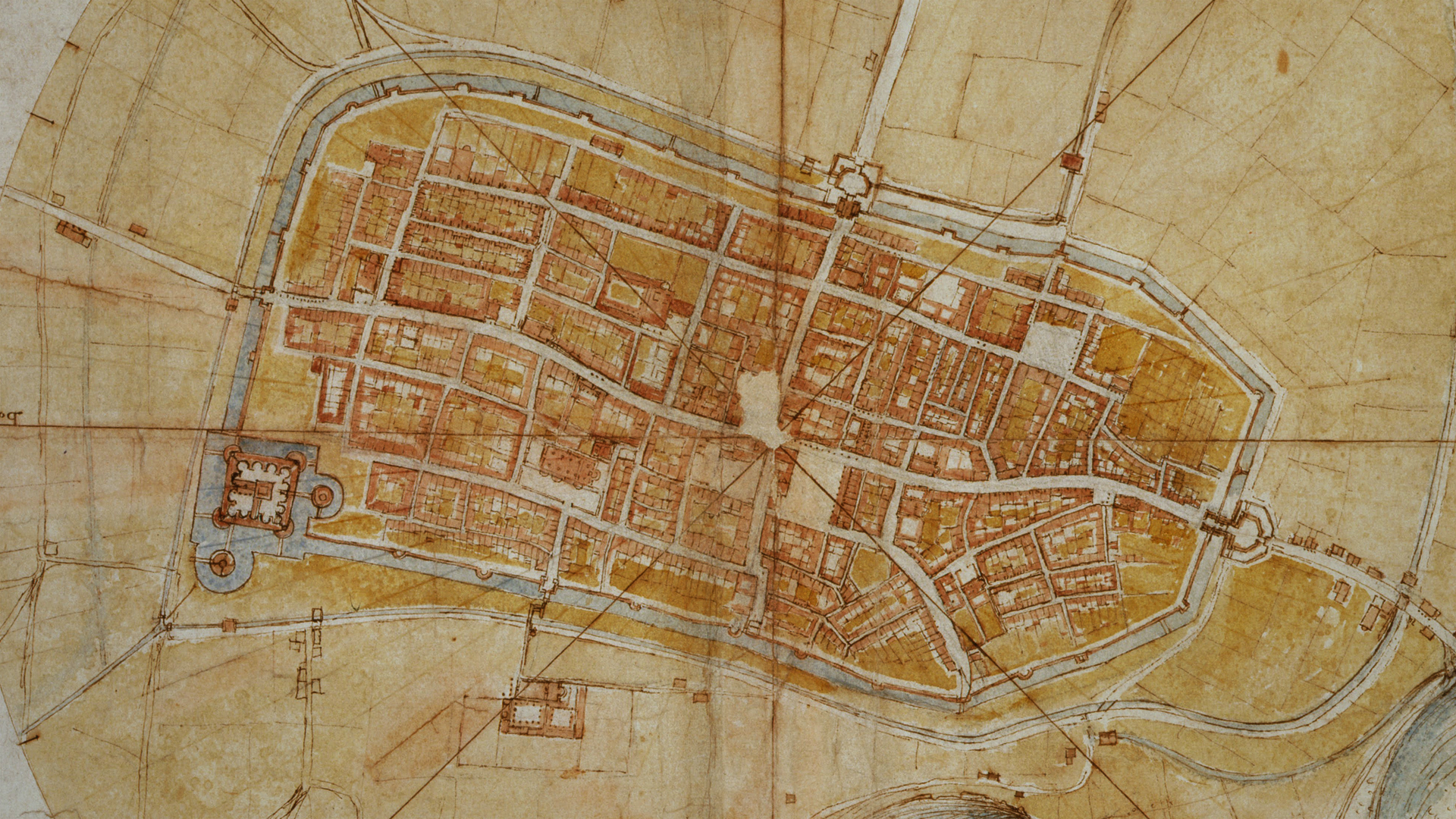
I had not previously had my attention focused on his cartography. Seeing them close up and in real life, however, impressed upon me how beautiful and informative these 15th century examples of cartography could be.

Take his map of Imola for example (click for large version):

Map of Imola - Leonardo da Vinci

You could pretty much just plug this directly into a D&D campaign, and I absolutely love the aesthetic of it. Check out this video for how he made it:


You might also check out Random GM Tips: Visualizing City Block Maps.

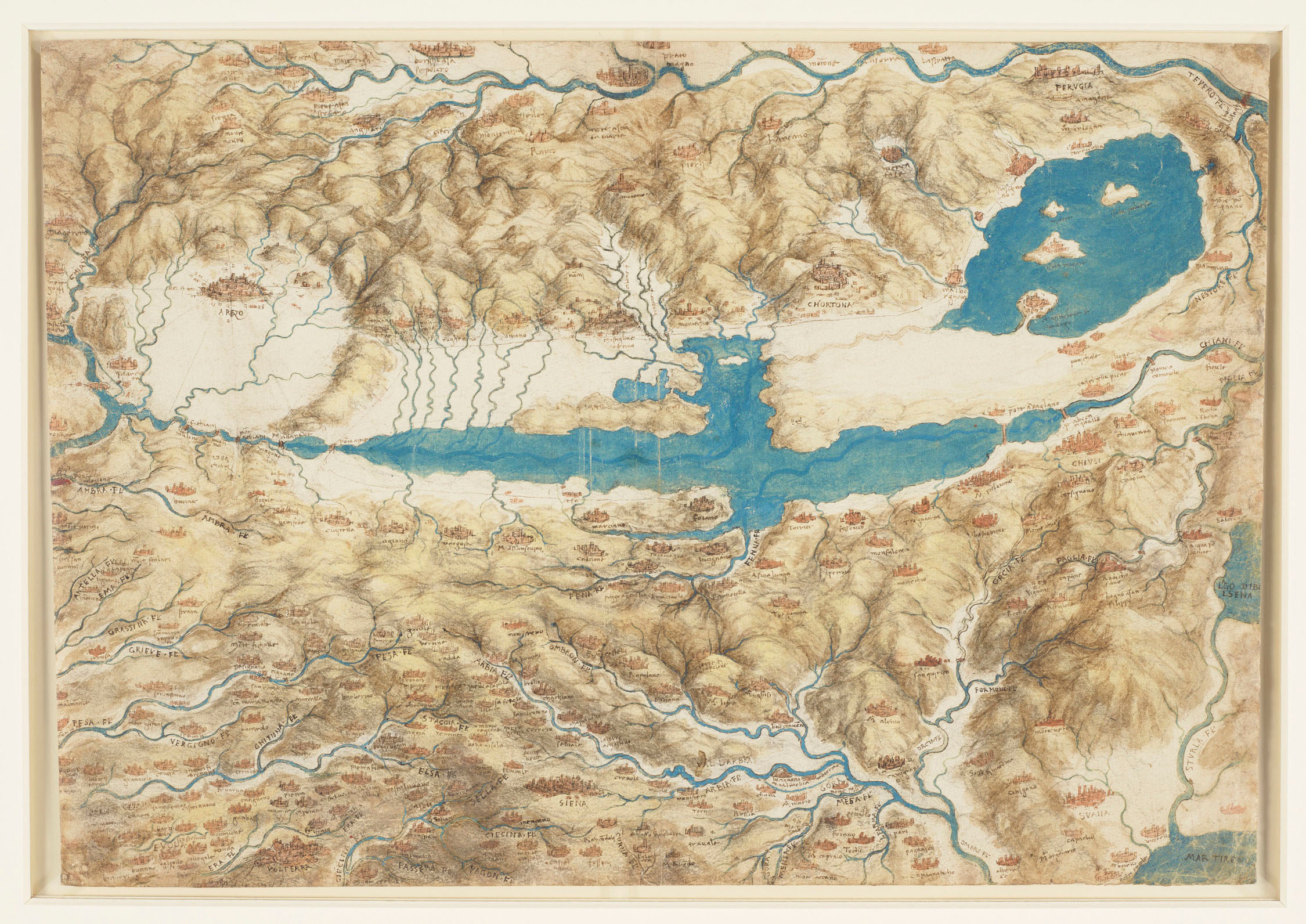
There’s also this map of Valdichiana:

Map of Valdichiana - Leonardo da Vinci

I strongly encourage you to click-through to appreciate all the detail in this map. (There’s even more when you see it in real life.)

I’m currently very tempted to use this map for the version of Loch Gloomen in my Blackmoor open table.

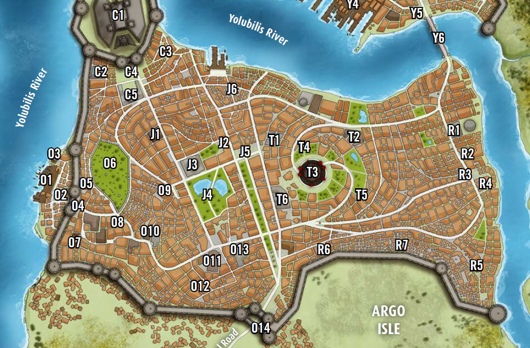
A common form of mapping for RPG cities is the block map. For example, here’s the city of Kintargo from the Hell’s Rebels adventure path:

Kintargo - Sample Map (Hell's Rebels - Paizo)

A common mistake when looking at such a map is to interpret each individual outline as being a single building. For example, when I posted a behind-the-scenes peek at how I developed the map for the city of Anyoc years ago, a number of people told me I’d screwed up by leaving too much space between the buildings. Except the map didn’t actually depict any individual buildings: Each outline was a separate block, made up of several different buildings.

When people look at a block map and interpret it as depicting individual buildings, how far off is their vision of the city?

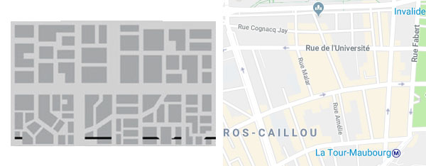
Well, we can actually see this exemplified in a few cases where artists have (in my opinion) misinterpreted block maps. Blades in the Dark, for example, has a block map for the city of Duskwall. Below you can see a sample of that block map (on the left) next to a block map of a section of Paris (on the right).

Block Maps - Duskwall & Paris

If it was not self-evident, the interpretation of the Duskwall map as a block map is supported by this description of the city from the rulebook:

The city is densely packed inside the ring of immense lightning towers that protect it from the murderous ghosts of the blighted deathlands beyond. Every square foot is covered in human construction of some kind — piled one atop another with looming towers, sprawling manors, and stacked row houses; dissected by canals and narrow twisting alleys; connected by a spiderweb of roads, bridges, and elevated walkways.

You can see that if you interpret Duskwall’s map as detailing individual buildings, the layout of the city actually becomes far more organized and well-regulated than seems intended by the text. This is, in fact, a common problem when GMs misinterpret block maps: Their vision of the city, and the resulting descriptions are heavily simplified.

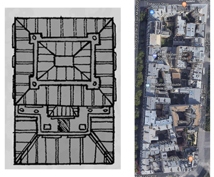
For example, when Ryan Dunleavy decided to develop a large version of the Duskwall map, he interpreted each block on the map as being an individual building (or, occasionally, two). Compare the resulting illustration of a single block in Duskwall (on the left) to what a single block in Paris (on the right) actually looks like:

Duskwall Block vs. Paris Block


(Please don’t interpret this as some sort of massive indictment of the artist here. Ryan Dunleavy’s cartography is gorgeous, and I recommend backing his Patreon for more of it.)

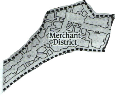
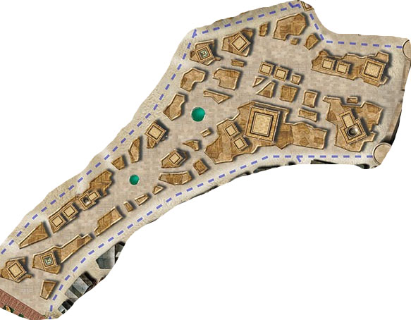
You can see another example of this with Green Ronin’s Freeport. When first revealed to the world in 2000’s Death in Freeport module, the city was depicted using a rough block map:

Freeport - Merchant District (Death in Freeport)

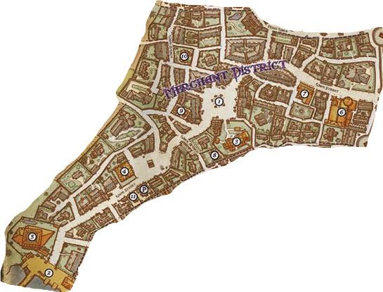
In 2002, for the original City of Freeport, this was redone with most of the blocks being represented as individual buildings:

Merchant District - Freeport (City of Freeport - Green Ronin)

The map was redone again for The Pirate’s Guide to Freeport, this time reinterpreting the original outlines as a block map:

Freeport - Merchant District (Pirate's Guide - Green Ronin)

I pull out this example primarily to point out that sometimes a block map outline IS, in fact, a single building. Because some buildings are really big. Or, in other cases, they might represent walled estates, as shown here with the estates along the western edge of the map.

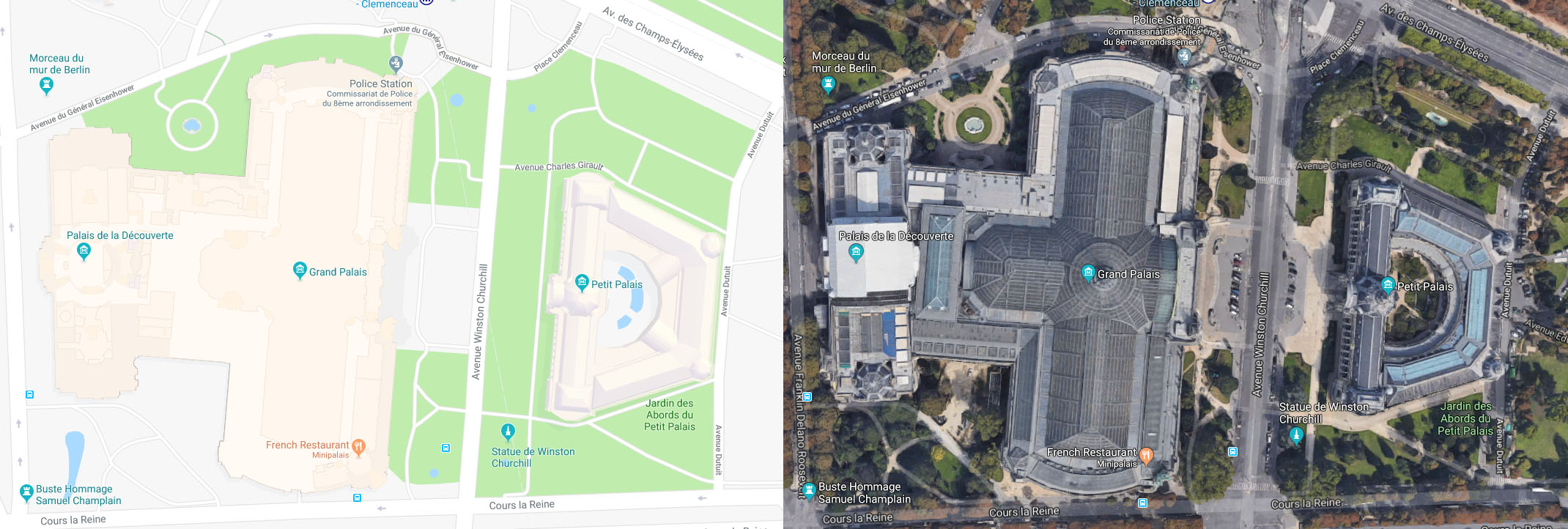
And here’s a real world example of this from Paris with both the Grand Palais and the Petit Palais:

Paris - Grand Palais & Petit Palais

(click for larger size)

The north-south cross section of the Grand Palais is fairly comparable to the Parisian block shown above.

CONCLUSION

My point with all this basically boils down to don’t mistake the map for the territory. One of the great advantages of the block map approach to city mapping is that it leaves so much to the imagination, allowing both you and your players to lay in immense amounts of fractal complexity onto a simple geometric shape.

(Which is not to say that block maps are the be-all or end-all of utility at the gaming table. You can take my copy of Ed Bourelle’s Ptolus map when you pry it from my cold, dead hands.)

And when you miss that opportunity — when your mental image of the block map reduces each geometric shape to a single building — you’re robbing the city of its grandeur, its complexity, and its flexibility.

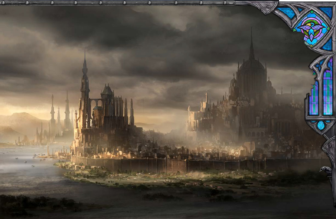
Take a moment to go back and look at the map of Kintargo, for example. Imagine what that city would look like if each block were, in fact, a single building. What you’ll probably end up with is a modest city still possessed of some good degree of size. But what you should actually end up with in your mind’s eye is this:

Kintargo - Hell's Rebels (Paizo)

Archives

Recent Posts


Recent Comments

Copyright © The Alexandrian. All rights reserved.