The Alexandrian

Posts tagged ‘better dungeon maps’

Go to Part 1

As we continue our Better Dungeon Maps project, let’s turn our attention to stairs. And basically, when it comes to stairs, there are two pieces of information we want encoded on the map: First, the direction the stairs are going (up or down). Second, where the stairs are going.

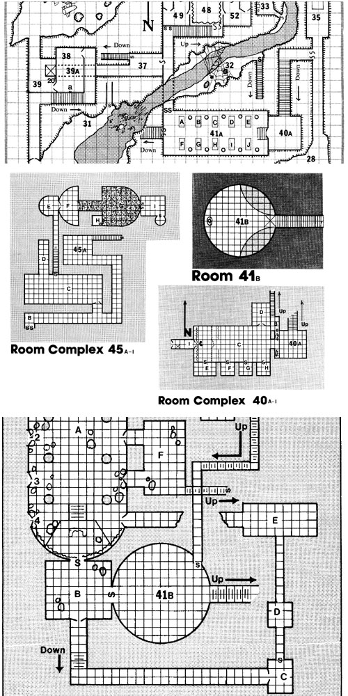
Let’s start by demonstrating the potential pitfalls of not encoding this information. I’ve often sung the praises of Jennell Jaquay’s Caverns of Thracia here before, but this is one place where it falls down painfully. Here’s a sample of maps from the module:

Caverns of Thracia - Second Level Map Selection

(click for larger image)

All of these maps connect to each other, but I doubt you’ll be able to puzzle out how those connections actually work. (Frustratingly, even the dungeon key won’t help you much.) When I was first prepping the module I spent the better part of half an hour trying to figure out which stairs connected to each other and then marked those connections on the map.

You can easily note, however, that the maps for the Caverns of Thracia clearly indicate up/down directions for the stairs. But it should be relatively easy to imagine what would happen if you removed those text labels, leaving you with undistinguished and enigmatical lines to puzzle over.

Fortunately, the problem of indicating directionality for common stairs is largely a solved one:
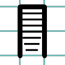
Stairs

The stairs taper in the direction of descent. (So the lowest portion of the stairs is located at the bottom of the picture above.)

But adventure modules are still maddeningly inconsistent when it comes to clearly indicating where the stairs go, despite the fact that doing so is so utterly trivial:
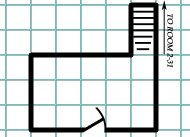
Stairs with Destination Label

For example, Keep on the Shadowfell indicates the destination of only one-third of the stairs on its maps.

(Another option I’ve seen is to key the stairs: So that Staircase A on Map 1 logically leads to Staircase A on Map 2. This can work. But since it’s usually just as easy to label the destination, as shown above, it’s probably the better option.)

SPIRAL STAIRCASES

Spiral staircases, however, aren’t quite so straight-forward. Here’s a typical example from I6 Castle Ravenloft:
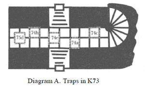
Spiral Stairs - Castle Ravenloft

It would be easy enough to supply a destination label for those stairs, but there’s really no way to tell whether they’re curving up or down.

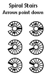
Roger the GS has recently proposed this solution:

Spiral Stairs - Roger the GS

Which seems like a good stab in the right direction. My only quibble with this is that it is not immediately apparent at a glance which direction the arrows are pointing. (They could just as easily be indicating the direction in which the stairs are ascending.)

It’s tempting to apply the same tapering solution we use for straight stairs to the problem. To my eye, something like this looks fairly acceptable:
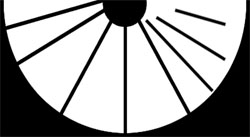
Spiral Staircase - Half

Even when extended to a three-quarters design, the iconography seems to remain fairly clear:
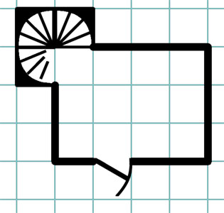
Spiral Staircase - Three-Quarters

But when you need to show the stair case spiraling both up and down from the same level, the result is considerably less satisfying:
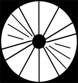
Spiral Staircase - Full

Hypothetically you could only have it taper at the absolute nadir of the stairs as pictured, but even with tweaking this seems very unclear to my eyes:
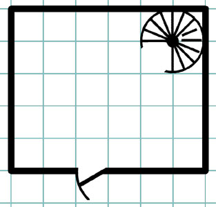
Spiral Stairs - Three Quarters

I’m increasingly convinced that labeled arrows may be the clearest way to go with spiral staircases. But do the arrows necessarily need to curve just because the stairs do?
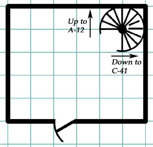
Stairs - Labeled Spiral

Here the double visual coding of the symbol (somewhat unclear on its own) in combination with the arrows seems, to my eye at least, to have greater clarity than either by itself.

On the other hand, here’s a final example from Dyson Logos’ Ruins of the Gorgon:

Spiral Stairs - Dyson Logos

Dyson uses a side-view map to make the destination of each stair relatively clear. (Although double-coding the info with a text reference could only add to clarity.)

At the end of the day, I still feel fairly stymied when it comes to providing a nice, clear icongraphy for spiral stairs. Your thoughts?RPG Blog Carnival

Go to Part 3: Light Sources

This post is part of the RPG Blog Carnival for Cartography.

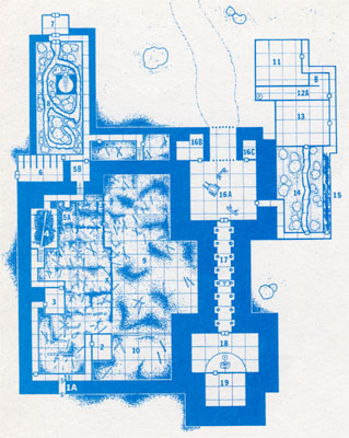
Over the past 30 years or so, there’s really no question that dungeon maps have become prettier. For example, here’s part of the map from A1 Slave Pits of the Undercity (published in 1980):

A1 Slave Pits of the Undercity

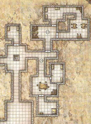
And here’s a similar map from 2008’s Keep on the Shadowfell:

Keep on the Shadowfell

The fancier textures certainly look very nice. And they may tell you a little bit more about what you’re looking at. (The tables are made of wood, for example.) But for the most part, the utility of the map from Keep on the Shadowfell is essentially unchanged from the utility of the simpler maps from two or three decades earlier.

One of the ways in which “pretty” could be turned into functional utility, of course, is if the maps were offered in a format and size at which they could be easily turned into battlemaps and displayed on the table for the players to appreciate and interact with.

But setting that aside, how else could we improve the utility of our dungeon maps? Or, to put it another way, what information could we be coding onto our dungeon maps to make them more useful?

Let’s start with doors.

OPENING DOORS

The humble door:

Door

I don’t know about you, but one of the first things my players want to know when they come to a closed door is: Which way does it open? They want to know if they can get access to the hinges or if they’re going to need to bash it down.

And does it open to the left or right? If people decide to start peeking through it or want to brace it against a nearby wall, these become important issues.

Naturally one can just make a judgment call. But how nice would it be to have this information encoded on the map? (If for no other reason than to make sure it opens the same way when the PCs come back.) It seems like it would be pretty easy.

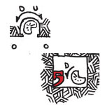
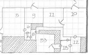
Ironically, the first module ever published for D&D included this information on the map. Here’s a sample from The Palace of the Vampire Queen, published by Wee Warriors in 1976:

Palace of the Vampire Queen - Map

(The circles represent secret or concealed doors.)

So, that’s one option:

Door - Palace of the Vampire Queen

We could also simplify that design by removing the swinging arc to leave a simple open angle:

Door - Open Angle

Another option, recently proposed, is Roger’s “Elvis Door“:

Door - Elvis Door

I’ll be honest that I’m not much of a fan of the Elvis Door, largely because nothing about it intuitively says “door” to me. And even after staring at it for awhile, I’m not entirely sure I’m reading it correctly. For example, when I look at it in actual practice (on a map designed by Telecanter), I keep trying to read the slant as indicating that the door is being pushed on the slanted side (which I’m fairly certain is actually the exact opposite of what the symbol is supposed to be communicating).

One last option, a simple arrow:

Door - Arrow Direction

This symbol has the disadvantage of only indicating the direction of the door and not its direction of swing. (Although it might be useful for a door that actually swings up like a garage door.

What are your thoughts? Which symbol (or symbols) seem to intuitively make the most sense to you?

For my mileage, I’m increasingly liking the doors from Palace of the Vampire Queen. I was initially skeptical of the extra arc line, but I’ve found that in actual practice this makes it much easier to use the maps. (Without the arcs, the simple angling line tends to simply “fade” into the rest of the map and disappear.)RPG Blog Carnival

Go to Part 2: Stairs

This post is part of the RPG Blog Carnival for Cartography.
Archives

Recent Posts


Recent Comments

Copyright © The Alexandrian. All rights reserved.