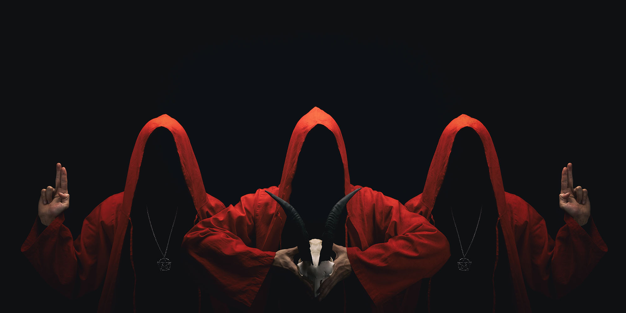
Aggah-Shan’s guards regularly patrol this level. There are 10 guards in total.
- A patrol of 1d2+1 guards cycle through Areas 18, 17, 20, 21, 22, and 19. (They move to a new area every 2d6 rounds.)
- The remaining guards are generally resting Area 21.
AGGAH-SHAN’S GUARD
Medium undead, lawful evil
Armor Class 16 (natural)
Hit Points 112 (15d8+45)
Speed 30 ft.
STR 18 (+4), DEX 15 (+2), CON 16 (+3), INT 10 (+0), WIS 15 (+2), CHA 12 (+1)
Saving Throws Str +7, Dex +5, Con +6
Skills Athletics +10, Intimidation +5
Damage Immunities poison
Condition Immunities poisoned, exhaustion
Senses darkvision 60 ft., passive Perception 12
Languages Giant
Challenge 5 (1,800 XP)
Slavish. The guard has advantage on saving throws against being frightened, charmed, or turned.
ACTIONS
Multiattack. The guard makes three attacks with its necromantic mace.
Necromantic Mace. Melee Weapon Attack: +7 to hit, reach 5 ft, one target. Hit: 8 (1d6+4) bludgeoning damage and 7 (2d6) necrotic damage
Aggah-Shan’s guard are undead warriors, wrapped in brown funerary linens and wearing crimson-red Anubian helms. Through the jackal’s mouth their skull can be seen, with red flames in their eyesockets. Each wields a top-heavy mace which crackles with purplish necrotic energy. They carry large, copper shields in the shape of a beetle’s wings.
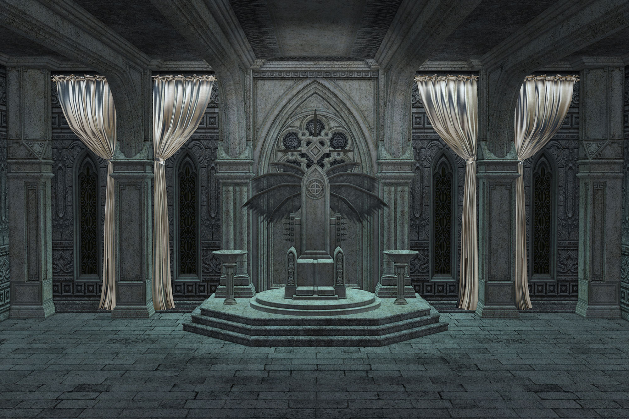
AREA 16 – THE OTHER THRONE OF IRON
A throne of black iron and gray stone sits in the middle of a blue-tiled room. The ceiling is painted with roiling flames.
TELEPORTATION THRONES: Characters using the throne in Area 12 to teleport arrive on the identical throne in this area, and vice versa.
SECRET DOOR: DC 30 Intelligence (Investigation) check to detect. The door is not trapped, but opening it releases the permanent wail of the banshee in Area 23 so that it can also be heard by characters in Area 16.
- Listening at the Door: DC 15 Wisdom (Perception) check can faintly detect the wail. Hearing the wail in this way, however, inflicts 3d6 necrotic damage (DC 15 Constitution saving throw for half damage).
- Wail of the Banshee: The wail has no effect on constructs or undead. All other creatures who hear the wail are afflicted by a powerful death magic and must succeed on a DC 25 Constitution saving throw. On a failure, a creature with less than 100 hit points instantly drops to 0 hit points. Creatures not reduced to 0 hit points instead stuffer 9d8+50 necrotic damage (or half damage on a successful save).
- Dispel magic will suppress the wail for 1d4 x 10 minutes.
AREA 17 – THE HALL OF SCENTED SMOKES
A dozen magical braziers line the length of this hall. Lighting any one of them causes all of them to alight, filling the room with colorful smokes carrying pleasant scents.
AREA 18 – LEY-LACED STATUE
A classical statue of a bare-chested archer bending his bow back, his foot placed upon the breast of a maiden who lies nude at his feet. Thick, blue-black veins run through the marble.
INTELLIGENCE (ARCANA) – DC 16: The statue is carved from ley-laced marble. This statue acts as a pearl of power that can be used up to four times per day. It is currently keyed to an adamantine arrow which fits into the archer’s bow (and is currently either in Area 15 or carried by Aggah-Shan).
LEY-LACED MARBLE
Ley-laced marble is a naturally occurring stone. During the metamorphic processes which form the marble, ley-energy permeates the impurities lacing the sedimentary rocks. The resulting marble (which is usually found on or near ley lines) is possessed of properties similar to a pearl of power. (In fact, it’s hypothesized that pearls of power were created by reverse-engineering ley-laced marble.)
Unlike pearls of power, however, ley-laced marble is not particularly efficient in its retention of magical energy. In addition to being difficult to excavate from the ground, ley-laced marble must be maintained in such large chunks in order to maintain its properties that it is rarely if ever portable in any true sense of the word.
However, rites have been perfected which allow a piece of ley-laced marble to be keyed to a specific object. Anyone carrying the keyed object can access the powers of the ley-laced marble at a distance of 1 mile per character level.
AREA 19 – HALL OF GILDED SKULLS
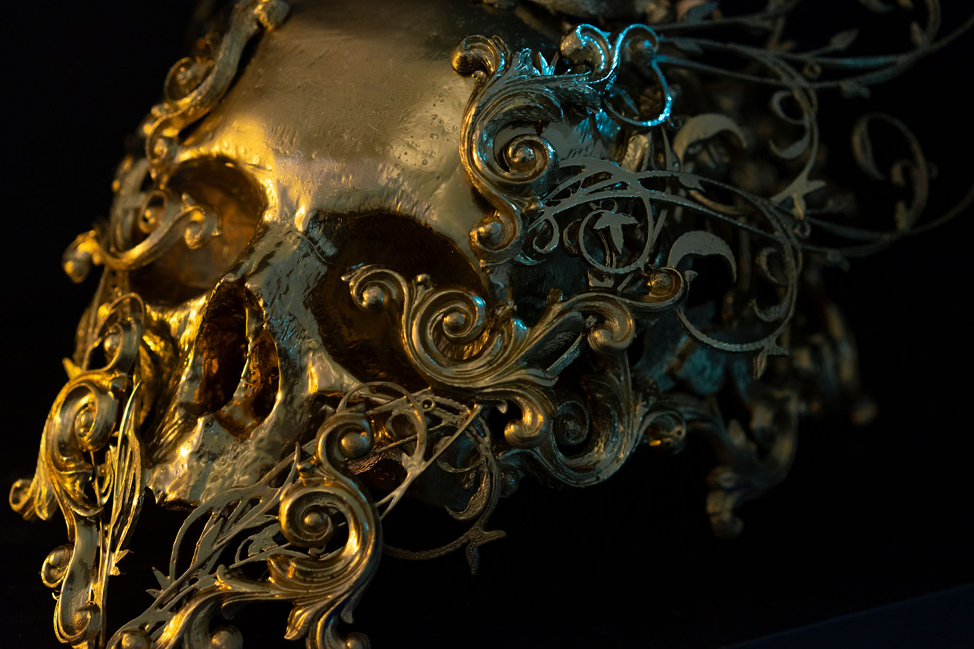
Six skulls gilded in gold sit on cushions placed atop marble pillars. Two pillars stand empty.
SKULLS: Each skull has a named burned into its dome — Verana, Elmchaea, Enel, Siust, Atath, and Mosdyna.
DM Background: These skulls belonged to Aggah-Shan’s enemies.
AREA 20 – AGGAH-SHAN’S LIBRARY
Most of the volumes in this library reveal a mind consumed with a strange, compulsive disorder: Gambling odds calculated, recalculated, and then calculated again. Written out at great length in varied tabular arrangements — vast expanses of endless tabulated data.
AGGAH-SHAN’S SPELLBOOK: But this library is also home to Aggah-Shan’s Spellbook. The book is designed to be opened by placing Aggah-Shan’s bony finger into the skull-faced keyhole on the cover. If any other finger is placed in that keyhole or if someone attempts to force the book open, it triggers a prismatic spray trap (DC 14 Intelligence (Investigation) to detect; DC 14 Dexterity (Thieves’ Tools) to disable; DC 20 Dexterity saving throw if triggered).
BOOK OF MRATHRACH: The library also contains the Book of Mrathrach (a chaos lorebook).
BOOK OF MRATHRACH
In those days when the Masters of Chaos still stirred and the echoes of their spirits were manifest within the Temples of the Screaming Dead tended by the midnight priests of the Earthbound Demons, there walked upon this earth the Man who would have made demons of all men; who would have immanentized the mortal flesh in eschatonic blood.
This book tells the bloody tale of Mrathrach. It purports to be a reconstruction of an ancient verse epic, although the passages of verse preserved within its pages are broken and irregular (although somehow beating with a primal pulse when read aloud).
Mrathrach was a warlord in the demon armies which “fought black-backed against that oily light of piety’s tyrannicies.” His faith to his master, “the Duke Gellasatrac,” is lauded and entire passages are given over to describing the great deeds of martial honor and the bloody human sacrifices he offered to Gellasatrac’s glory.
But when the war turns against the demon armies, the poem becomes an elegiacal transformation of the strife of conflicted duty. In the end, it describes how Mrathrach agreed to betray Gellasatrac to “the greater glory of the Masters and the presecient schismed schemes of the Shallamoth.”
And he drank of the Black Blood, the Holy Gift of Gellasatrac. So Mrathrach became the First of the Vested — vested in the trust of his masters; vested in their power; vested in their fate. The first quenching by which the bands of power would be forged.
AGGAH-SHAN’S SPELLBOOK
Spells marked with * are from the Ptolus sourcebook.
CANTRIPS: chill touch, shocking grasp
1st LEVEL: burning hands, charm person, color spray, detect chaositech*, detect evil and good, dissonant whispers, endure elements, expeditious retreat, feather fall, fog cloud, grease, jump, mage armor, magic missile, shield, silent image, sleep, Tenser’s floating disk, unseen servant
2nd LEVEL: aid from the future*, alter self, arcane lock, blindness/deafness, blur, darkvision, enlarge/reduce, flaming sphere, invisibility, levitate, mirror image, ray of enfeeblement, rope trick, see invisibility, spider climb, suggestion
3rd LEVEL: blink, conjure animals, fly, gaseous form, haste, hold person, hypnotic pattern, Leomund’s tiny hut, lightning bolt, magic circle, slow, tongues
4th LEVEL: banishment, confusion, conjure minor elementals, polymorph, stoneshape, stoneskin, wall of fire
5th LEVEL: animate necrosis*, animate objects, cloudkill, contact other plane, divinatory expungement*, enervation, mislead, wall of stone
6th LEVEL: chain lightning, create undead, disintegrate, eyebite, flesh to stone, move earth, teleport trace
7th LEVEL: month of Vallis*, prismatic spray, teleport
AREA 21 – AGGAH-SHAN’S GUARD
1d8+2 of Aggah-Shan’s necromantic guards can be found here. (There are 10 total. The others are patrolling this level, as described above.)
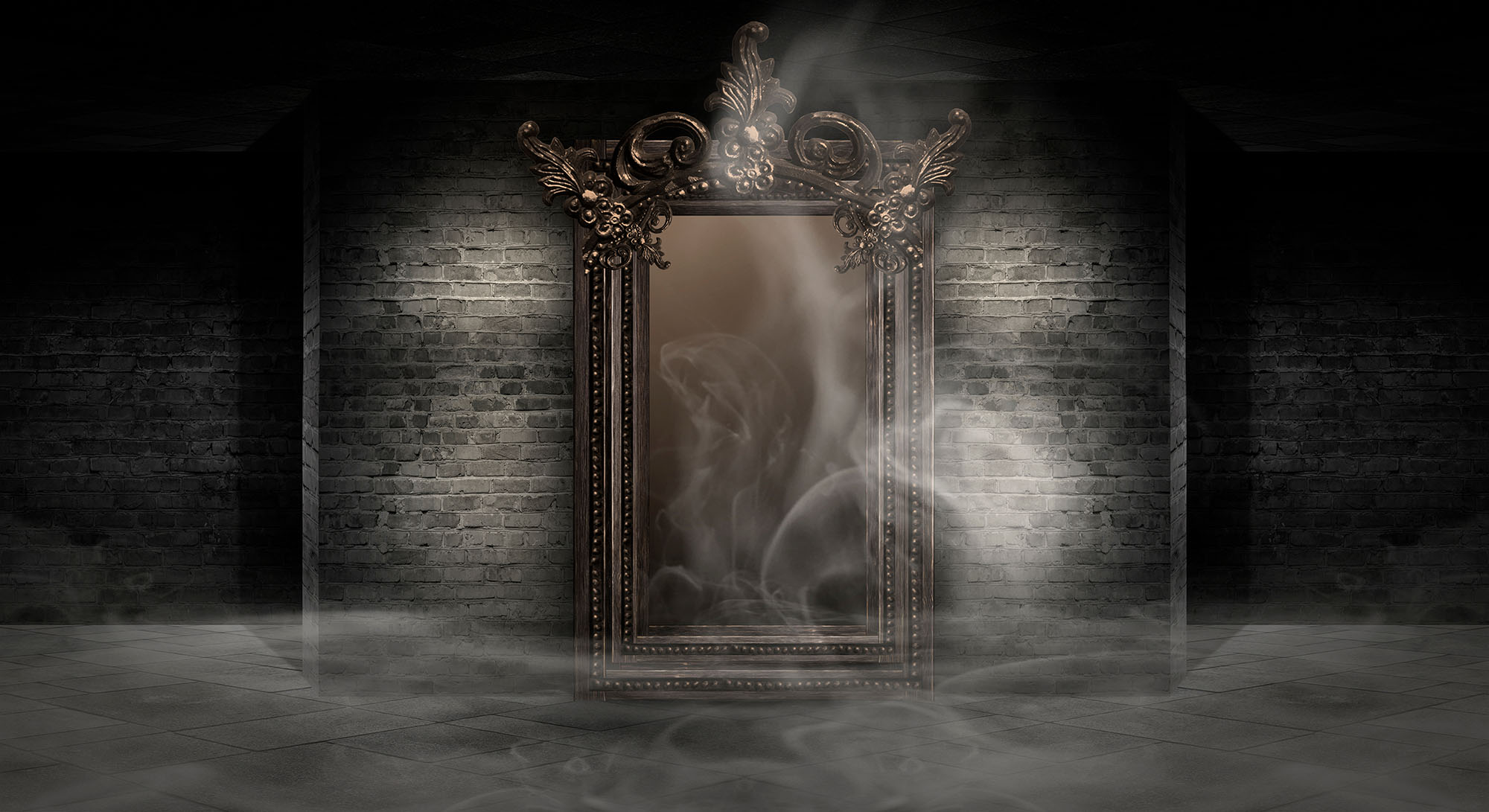
AREA 22 – THE FALSE PHYLACTERY
BATH: The southern end of this chamber is a bath made of black marble with two silver dragon heads looking out over the room.
PRISMATIC CUBE: Levitating in the center of the room is a set of double-layered prismatic wall spells forming a cube.
FALSE PHYLACTERY: Within the prismatic cube is a hollow mithril statue in the shape of a man lying on a cushion of blue velvet. A heart-shaped trapdoor on the statue’s chest can be opened, revealing adamantine wires which have been welded to various points within the statue and then bound together into a very specific and cleverly-woven knot. The statue has an arcanist’s magic aura placed upon it to make it appear to be a lich’s phylactery (but it is not).
AREA 23 – TRAPPED HALL
Beyond the secret door in Area 16, a short hallway leads to Area 24.
WAIL OF THE BANSHEE: This area is filled with a permanent wail of the banshee. The wail has no effect on constructs or undead. All other creatures who hear the wail are afflicted by a powerful death magic and must succeed on a DC 25 Constitution saving throw. On a failure, a creature with less than 100 hit points instantly drops to 0 hit points. Creatures not reduced to 0 hit points instead stuffer 9d8+50 necrotic damage (or half damage on a successful save).
- Dispel magic will suppress the wail for 1d4 x 10 minutes.
TRAP – CRUSHING WALL: In addition to the wail, this area also has a pressure plate in front of the door to Area 24) that triggers a crushing wall trap (affecting everyone in the hall).
- Mechanical trap
- DC 17 Intelligence (Investigation) to detect the trap.
- DC 22 Dexterity (Thieves’ Tools) to disable the trap.
DOOR TO AREA 24: The door is also trapped. Anyone touching the door triggers an incendiary cloud (that lasts for 1 minute, moving into Area 16).
- Magical trap
- DC 17 Intelligence (Investigation) to detect the trap.
- DC 15 Intelligence (Arcana) to identify the spell effect.
- DC 20 Dexterity saving throw for half damage.
AREA 24 – TRUE PHYLACTERY
PRISMATIC CUBE: Levitating in the center of this room is a set of double-layered prismatic wall spells forming a prismatic cube. Inside the cube if a forcecage.
TRUE PHYLACTERY: Within the forcecage is a sphere of adamantine (4-in. thick). Within the sphere are three humanoid figures of taurum (the true gold which makes common gold naught but a bauble), each inscribed with a single rune upon its chest.
Destroying the figurines destroys Aggah-Shan’s phylactery.