When I posted Black Book Beta Response 6 last week, it didn’t get much of a response. After some reflection on the matter, I have several hypotheses for this:
- With the funding project done, nobody is really paying attention any more.
- People don’t really care that much about art.
- Since I screwed up the options on the poll, most people couldn’ t vote when they saw the post.
- The fact that you needed to go flipping through the book to look at the art made it less likely for people to comment/participate.
On the theory that #3 or #4 are most plausible, I’m going to try this again. And this time I’m going to do it better. (Assuming I don’t screw up the poll again.) Below the poll you’ll find that I’ve included all the questionable art that I’m asking for your feedback on. I’m also adding in a few additional pieces that people have specifically commented on.
If you voted before, feel free to vote again. And, again, please feel free to leave a comment pointing out other pieces of art you don’t like. I’m particularly interested in hearing your feedback on any pieces that felt too “familiar” to you. (I’m using public domain art, but I still want the book to feel fresh.)
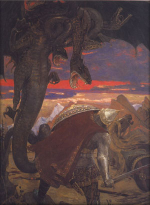
Page 1 – Dragon Fighter
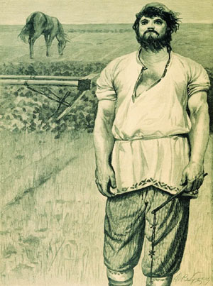
Page 10 – Peasant With Wanderlust
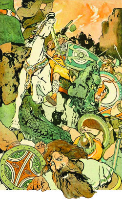
Page 15 – Battle With Giants
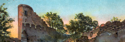
Page 19 – Ruined Buttresses
Page 44 – Animal Lover
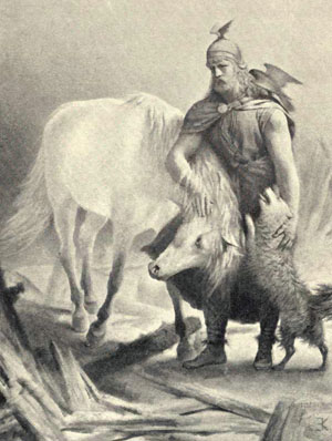
Page 52 – Ice Floe
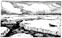
Page 58 – Parley on a Hill
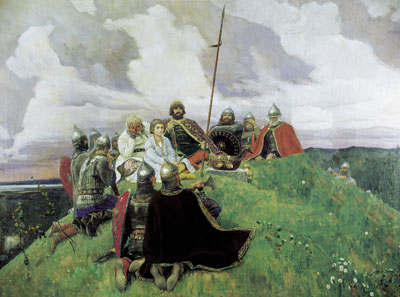
Page 61 – Court of Lions
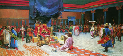
Page 62 – Expeditionary Party
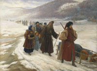
Page 65 – Warrior Heading to Battle
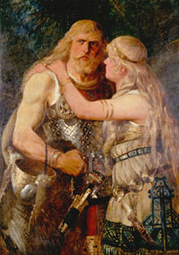
Page 67 – Wolf and Rider
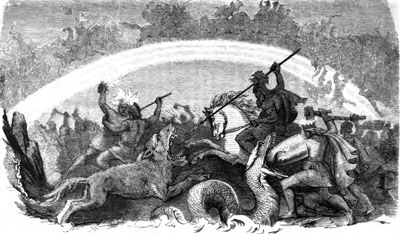
Page 69 – Siege of the Sultan’s Cannon
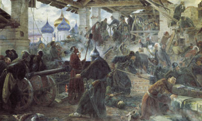
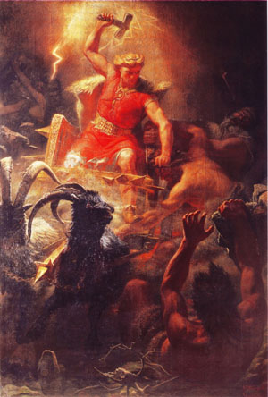
Page 71 – Dude With a Hammer
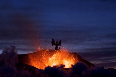
Page 74 – Dragon Volcano
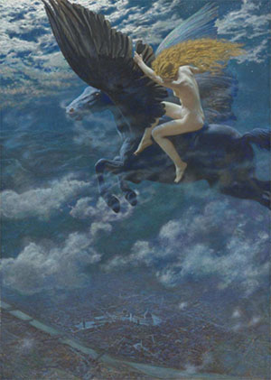
Page 82 – Pegasus Rider Above the City
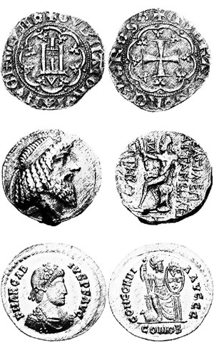
Page 107 – Coins of the Ages
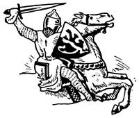
Page 118 – Horse and Knight
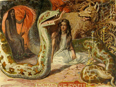
Page 123 – Loki’s Get





I love the “Coins of the Ages” pic, I vote keep that one.
I generally prefer no art over using public domain art. I even prefer scribbles done by the author (so long as it isn’t absolutely hideous) over public domain art.
I suspect most people look at public domain art as public domain art, and aren’t that partial to certain pieces over others.
If you’re going to go with public domain art, I’d recommend using art that doesn’t clash too much in look/style. Of the pieces/styles given above, I’d go with B&W line art that looks like p. 118 (there should be quite a bit of medieval B&W line art available).
I’m happy to see polls, but I would like to see polls on actual content, like the human racial bonus, for example. I loathe the races chapter, as I have explained before, and I’m sure other people have other issues.
The most important aspect of the art you keep will be that it meshes with the style of all the commissioned art. Having not seen that, it’s hard to judge which of these should stay…
I don’t really have an issue with any of the images themselves, just with how they are used. I see no problem at all with public domain art. Many lesser-known realist artists like Luminais and Vasnetsov have lots of extremely high-quality paintings which are not very widely recognized (and I don’t think recognizability is actually that big an issue even if it occurs). In my opinion they capture the ‘feel’ of early RPG’s better than most art in modern rulebooks.
I don’t see a problem with mixing different art styles, either, so long as it is done with some finesse. I don’t like how some complex, full-color, multiple-figure works are used as small pieces of clip art (as on page 54, for example – there are a number of others). Either make such images big enough to view or cut them. Doing the same thing with simple line drawings, on the other hand, works great (e.g. page 45). There are actually a lot of places where I see similar issues, where certain images are not given the space they need. As an illustration of what I feel should happen in these instances, pg. 81 is good – it has a single, large image cropped in an appropriate manner. Not a hugely interesting image in and of itself, but that is absolutely OK – it fits, and that matters more. Pg. 82 is not good – it has three disparate images; the middle one is compressed so far we cannot tell why it’s used to illustrate urban adventures instead of aerial adventures. I think a single, properly cropped section of one of the other two images would be a much better fit. This is more of a layout issue than an image selection issue per se.
The other issue I find is occasionally inappropriate pairings. The most startling is Dragon Volcano in the stunts section. The fact that it is the only photograph in the book is less jarring to me than the fact that it just has no business being where it is.
One other comment – you should probably revisit Parley on a Hill with an image editor to blur out the clone stamp marks.
Please don’t take this as a trashing of your layouts – I can see that working in art with the sidebar system is tricky business, and there are only so many pieces that lend themselves to the wide aspect ratio cropping which tends to work best.
I agree with the thought that what you keep and what you chuck depends on the overall tone you’re going for. I kind of like the variety of subjects and styles, in that sense. On the same note, perhaps it would be good to rely less heavily on Norse myth imagery.
The only things that really rub me the wrong way are the “dragon volcano” (too CG-ey), the pegasus rider (Why is she both naked and side-saddle, without a saddle no less, hundreds of feet off the ground?! And why is she grabbing the poor horse’s wings when it needs them to fly with?), and the size of the coins image, which I agree could be shrunk down without anything being lost.
I have to admit that #1 and #2 are fairly accurate for me. Art in the age of iPad PDF viewing doesn’t really do anything for me. Hypertexting is far more important.