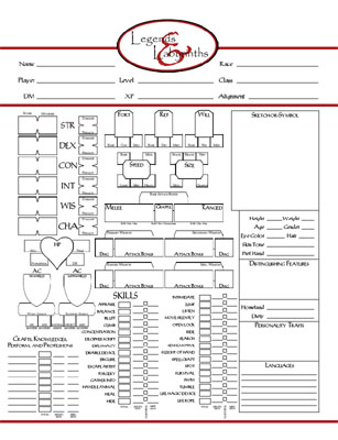
Let’s take a peek at the Black Book Beta character sheet for Legends & Labyrinths:
Like the rulebook itself, this is a work in progress. (I’m not particularly happy with the skill section, and there are some other sizing and spacing issues that need to be tweaked and resolved.) But this should give you some idea of what I’m aiming for.
As with many elements in Legends & Labyrinths, one of the key hurdles I had to avoid in developing this character sheet was what I came to call the “illusion of simplicity”. For example, I had a long struggle with the illusion of a character creation process so simple that you just “rolled ability scores, picked a class, and then started playing!” It’s a seductive vision, but it never actually existed. (And there was a reason it never existed.)
These “illusions of simplicity” served as siren songs. If, as a game designer, you pursue them you’ll end up handicapping your game. The idea that your life would be easier if you didn’t need to buy shoes bumps against cold, hard reality when you start talking about lopping your feet off with an axe.
In the case of this character sheet, the illusion of simplicity I struggled with was the classic sheet from the BECMI Basic Set that had indoctrinated me into roleplaying 20 years ago. Wouldn’t it be great if your character sheet didn’t have anything on it except character name, alignment, class, level, ability scores, and saving throws?
But the reality was that the BECMI sheet achieved its simplicity by not including some key forms of utility.
On the other hand, I also didn’t want (or need) the spreadsheets-of-doom which so many character sheets have become.
REFERENCE LAYERS
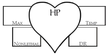
The solution I eventually developed was the concept of “layers”. For example, here’s the hit point section:

The iconic heart gives you a clear, pictorial reference. Collectively, these distinct graphical shapes keep the sheet from turning into a gray haze. It also gives you a large palette for keeping track of your current hit points.
The top layer contains the “most important” info. Below they you have secondary info that you’ll want to have for easy reference, but not on a frequent basis: Your max hit points. Any temporary hit points you’re currently benefiting. A place to track nonlethal damage. And a place for noting damage reduction if you’ve got it.
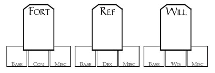
As a different example, here’s the saving throw section:

This is pretty basic: Once again you’ve got a distinct shape conceptually grouping these stats together. The top layer contains the total saving throw bonus (the key information you need to reference during play), while the layer below that lists the various modifiers that build that top layer stat.
What I like about the sheet is that, when you look at it, the top layer of information “pops out”. In play, it feels like you’re using a much more streamlined character sheet because of that — but you’ve also still get access to all that additional information when you need it. (And I think this will be even more true as we tweak the spacing and layout issues.)
MORE THAN JUST STATS
I also feel its important for a character sheet to contain more than just game mechanics. That’s why the right hand column is given over to description. This is broken into three types:
First, the “Symbol-or-Sketch”. This has vanished from most modern character sheets, or it gets buried somewhere on the second or third page. But having this space on the front of the character sheet for my old school campaign has evoked all kinds of evocative doodling and drawing. (I think there’s something about having that blank space right in front of you during play that encourages players to start filling it up. If nothing else, it’s a good space for taking notes.)
Second, concrete requests for information. Height, Weight, Age, Gender, and the like. This establishes a fairly standard scaffold to start hanging your character on.
Third, an invitation to create in bold strokes. The boxes for “Distinguishing Features” and “Personality Traits” are deliberately open-ended. You can put pretty much anything you want in there (or ignore them entirely). But the idea is to lay out a few bold ideas. I find that, particularly for new roleplayers, writing down a few key words like “impetuous” or “always lying” or “loves to grin” is often the best way to jump-start a character.
Those of us who like multi-page biographies and character studies, of course, are still free to tack on as many supplementary pages as we like. But I’m a big fan of taking new players, handing them a character sheet, and letting them pour their imagination onto it. When it works — when those new players invest themselves in the role they’ve created — you can create a gamer for life overnight.
The streamlined system for character creation in Legends & Labyrinths is the first part of that process: It allows new players to take control of creating their first character (without feeling overwhelmed by endless details for which they have no context). And then, hopefully, this character sheet seals the deal by putting the non-mechanical elements of character creation front-and-center: Inviting them to start thinking of their character as more than just a collection of numbers.


Great sheet, I like the level of detail, as well as the steps taken to emphasize the simpler aspects. I would tweak the sheet by doing two things:
1) Make the lines around the top layer shapes thicker, to show their importance & to help make those parts pop out better.
2) I would also add a section for contacts, allies, cohorts, hirelings, & the like. You said that you wanted to push that part of the game, & here’s your chance. A blank spot on their character sheet will prompt some players to fill it in, & they’ll have to use the “sidekick” mechanics to do so. It’s a way to integrate your design philosophy & encourage the kind of game that you wanna see. If space is an issue, you could take it from the languages section, that blank space below the skills (which looks a little bit awkward, BTW, considering how full the rest of the sheet is), &/or the preferred hand line (which I find superfluous, IMO).
Again, a much better sheet than many I’ve seen or used. I’ll definitely use something like this in my D&D 3E games, & I may just have to take some of your ideas for a homebrew system that I’m working on. Again. 😉
That’s a beautiful first draft. I quite like the idea of using iconography to visually indicate the math involved in calculating a statistic. I do have some suggestions, a number of which stem from observations while designing and testing my own 3.5 character sheets. I came to the conclusion that the primary purpose of a character sheet is utility – that is, it should make it easy to find the information that you are looking for as quickly as possible, with as few calculations as possible. This will certainly color my suggestions.
1) I like the Speed icon the best. It has added bonuses on top, the speed visually highlighted in the middle, and derived scores are on the bottom. It would be nice if all the icons followed the same format, so a player gets a visual hint that the numbers at the top are added to produce the value beneath them.
2) The BBB indicates that flat footed and touch attacks are both still going to be common. If you do report multiple AC values, I feel that shieldless is of less utility than either of those.
3) The damage and penalty records for statistics are of less utility than simply reporting current score and modifier. It takes no more room, but prevents a mental calculation.
4) The damage areas should be lengthened to account for things like +1d6 fire or +2d6 sneak attack. I think I’d also sacrifice the pleasing symmetry for uniformity and make each weapon area report attack, then damage.
5) A character sheet needs to have space for equipment. In my experience it’s the most complicated part of a (non-wizard) character to track and has woefully poor support in most character sheets, so most inventories are scribbled in the margins or on the back. One possible way to integrate equipment with the current sheet is to include clothing description on this sheet (as part of the characterization section) and then have an extensive inventory on a separate sheet. One feature of my sheets’ inventory system that has proven useful is a field next to each item to indicate what pack, pouch, or other container (if any) it is in. Knowing what’s in your backpack and what’s on the mule is useful when the latter gets eaten by a dinosaur.
6) Putting the portrait and other descriptive features on the left side or top of the sheet will give them much greater emphasis, saying “my character looks like this” before “my character has these stats” without sacrificing utility. I applaud you for placing them so prominently already.
7) I found putting a large “spells and abilities” section on the “in-combat” side of my sheet helped immensely. The same space holds spells, daily-use abilities like a barbarian’s rage, and situational abilities like a rogue’s sneak attack options along with space for descriptions. Players don’t have to flip through character sheet pages to see what options they have in combat. This is less an issue with your less complex system, but might be worth considering if you have a couple of extra lines.
That’s probably more unsolicited advice than you wanted. Take it with a grain of salt – it’s looking great already.
Good stuff, guys. Keep it coming.
Re: Equipment. If you want a look at the rough draft of the L&L equipment sheet, look here. When that sheet was designed, I was anticipating “what the character currently has equipped / is wearing” to be on the front of the sheet. But that diagram will now be appearing on the equipment sheet itself.
Re: Skills. I agree. That whole section is awkward and I’m not happy with it. I keep feeling like there’s a better way to do it than this “do the math for every skill” method. (For example, I played with just calculating the class/non-class values for each ability score. But then it’s too difficult to reference any given skill because you have to look in six or twelve different places for it. And if a skill gets a modifier from somewhere else — magic ring, spell, racial bonus — you’re stuck doing math on the fly.)
I really like your sheet.
Just wanted to point out that deity is misspelled as “diety”. It looks good and the other comments do a good job of pointing out other possibilities.
I don’t know if I actually like the idea, but one possibility for skills is to copy the format for profession, craft, knowledge, and perform. So, calculate your non-class skill values (since the majority of skills are non-class), and then leave space under that to list class skills and skills with misc bonuses. Utility wise, the player just needs to skim the class and modified skills. If that’s the relevant skill, the net modifier is right there. If you don’t see the skill, it uses the default bonus you calculated previously. Since most classes don’t have a ton of class skills, the list should stay pretty short and manageable.
Overall, this could save a lot of space, but at the sacrifice of recalculating the class skill value during level ups, and for rogues the list could get long, especially at higher levels.
“I would also add a section for contacts, allies, cohorts, hirelings, & the like.”
^
This.
It’s pretty inconvenient forgetting about a hireling or familiar for a level or more and having to backtrack to figure out where he/she/it was left behind. It’s even worse when after a big battle the DM turns and asks, “hey, what was your mercenary doing during that fight?”…who? Oh yeah…damn. A place of prominence on the character sheet would ensure that hirelings play a greater part in the adventure and would encourage a sense of cohesiveness–a familiar or other some such thing shouldn’t be an afterthought.
Nooooooooooo.
Why, why, why, why, WHY does every single RPG in existence not leave enough room on a character sheet for frequently changing stats like Hit Points?
Seriously. I’m thinking, like, every single session my “HP” are going to change MULTIPLE TIMES. I’ll be rubbing it out, or crossing it out, wearing away at the paper and needing to spread out. Maybe as I use my eraser I’ll overstep the bounds of the tiny “HP” box and scrub my Max HPs by mistake.
The “HP” box should be REALLY BIG. Because it’s going to change a lot and that involves spreading out.
The “Speed” box? That will change, well, basically never – I’ll write in it once, then that’s it. So why in the name of all that is holy are the HP and Speed boxes THE SAME SIZE?
Madness. L&L is BY FAR the only RPG to get this wrong, but seriously, it’s so obvious that I’m stunned there’s anyone that doesn’t get it right. Please, please, please, for the sake of players everywhere, make frequently-changed boxes bigger. Please.
LOL, I tend to agree (though much less empathically)…
Why don’t you split it into two pages. One page for character advancement: description, stats, skills, (multiple!) classes, HD etc. One page for combat: all the necessary stats including Ini, AC, saves, speed, weapons and attack stats, HP (yes, this needs more space!), feats, special abilities, item options. Probably a third page for spells and a fourth for equipment. Having *all* the combat stats one one page would greatly reduce page flipping and speed up combat.
[…] Alexandrian posted a really cool character sheet for his Legends & Labyrinths 3.X […]