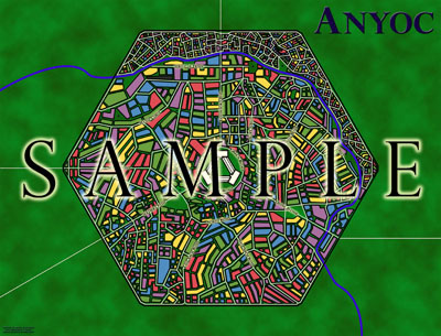
When I finished putting everything together, this was the map I had created. I’m fairly proud of it. (Which would explain why I’ve written a four part series on its creation.) It’s not the best map of a fantasy city ever published, but for a city supplement that can be purchased for as little as $7.99, I think it’s fairly impressive.
Of course, I’m biased. (And shilling.)
(What is the best map of a fantasy city every published? For my money, Ed Bourelle’s map of Ptolus wins that distinction hands-down. It’s a beautiful work of art, featuring layered geography; individual buildings; crystal-clear information clarity; and an enormous amount of utility. Quantity isn’t the same thing as quality, but it’s notable that I have a version of the Ptolus map hanging on my wall which is more than six and a half feet long. And, even at that immense size, it remains an astonishingly beautiful piece. The map of Anyoc, by contrast, is designed to be viewed at just 21″ x 16″ — which is big, but not huge.)
One of the things I love about mapping is the ability it has to provide a conduit for inspiration. Some of the best ideas I’ve ever had have been the result of my brain churning something out because there was a blank piece of graph paper that needed to be filled.
Designing the map for Anyoc was no exception.
Let me back up for a second and talk about the history behind City Supplement 3: Anyoc.
Anyoc was originally created back in 2001 as the setting for an adventure module. A playtest draft was completed and playtested (which is reflected in the playtest credits to be found in the published book), but the project was cancelled before a final draft was completed — partly because the publisher was already moving away from D20 modules and partly so that I could focus on a supplement called Gods & GoddessesTM (which was also cancelled before it was completed).
In 2002, Campaign Magazine started publishing my new column: Cities of Fantasy. Each issue of the magazine featured a complete fantasy city designed by me. I wrote two original columns, recycled and expanded the unpublished Anyoc material for the third, and started work on three more columns.
Unfortunately, after publishing a single column (featuring the city of Dweredell), Campaign Magazine went out of business. So the material was shelved again.
And shortly thereafter I got tired of my projects being cancelled by other people for reasons that had nothing to do with the work itself, so I took a hiatus from the roleplaying industry and when I came back I founded Dream Machine Productions.
All of which is to say that City Supplement 3: Anyoc was originally going to look a lot like City Supplement 1: Dweredell — a shorter, cheaper book detailing roughly a dozen locations.
But as I was working on the map, a couple of things happened: First, I kept getting struck by inspiration as I considered the various stories behind the buildings and streets I was drawing. Second, I realized that there was a serious mismatch between the detail of the map and the detail of the gazetteer. It just didn’t make a whole lot of sense to have a poster-size map serving up only a handful of detailed locations.
So, despite the fact that the entire book had already been laid out and proofread, I decided to scrap the existing gazetteer and rewrite it basically from scratch. At the time, I was appearing as Inspector Colquhoun in The Hollow by Agatha Christie. As the requisite detective in the story, I spent most of the second act onstage, but during the first act I was just sitting backstage waiting for the murder to happen.
So I would sit in the dressing room with my laptop, busily working away with fresh inspiration on an expanded gazetteer for the city. The final result more than tripled the number of locations detailed.
And that’s how the map of Anyoc was both my creation and my muse.


ARCHIVED HALOSCAN COMMENTS
Justin Alexander
Re: World maps. Man, I wish I had a suggestion for you. I put a lot of thought into weather patterns, climatology, and geography… but from a visual standpoint, my world maps suck.
Friday, October 24, 2008, 5:27:47 PM
Justin Alexander
Re: Buildings outside the wall. Specifically, no buildings within a quarter mile of the walls (which pushes them off the map). In tomorrow’s (final) installment of this series, I talk a little about the creative history of the city. Short version is: The city was originally designed for an adventure module, and the history of the city (involving the Necromancer’s War and the Year of the Dead) had a significant impact on the adventure.
When converting everything into a City Supplement, on the other hand, I realized I had a disproportionate amount of detail on events which had little to actually do with the city itself. So a lot of that information got scaled back.
However, the final gazetteer does still contain information about the ways in which food comes into the city and the agrarian trade is handled.
Friday, October 24, 2008, 5:26:50 PM
JohnnyDM
By the way, kudos for using sat images for inspiration. We do indeed live with incredible tools at our fingertips. Having zoomable satellite imagery of the whole planet available to everyone with internet access has made the world a better place.
Right now I’ve been poring over sat images of mountain ranges for inspiration. The FRP maps I’ve created for my world use contour lines and I’m looking for something more visually pleasing. Any suggestions?
Thursday, October 23, 2008, 7:50:01 AM
JohnnyDM
No buildings outside the walls? Where are the farms? A city that size would require an immense amount of farm/grazelands to feed it. One of my major criticisms of Waterdeep was it would be impossible to feed it’s inhabitants. It has a huge population but was surrounded by swamps and the docks were too small to accomodate enough food laden ships even if they were arriving around the clock. The size of pre-modern cities was dictated in a large part by the availability (proximity and access) to food. Cities would be surrounded by intensely farmed (and fished for port cities) areas to support the urban population. The default answer/cop-out is “magic” feeds the people. Clerics of agrarian deities constantly casting “create food” and turning their temples into supermarkets. There is nothing un-defensive about buildings outside the walls (provided they’re not against the wall). Medieval walled cities were meant to protect the peasantry as well as the city-dwellers in time of war. The Lord was obligated to protect his subjects and the peasants were expected to seek refuge within the walls during an invasion.
Thursday, October 23, 2008, 7:40:20 AM
Justin Alexander
@Charles: Sorry you don’t like the map. However, I will note that:
(a) Many of the buildings do share walls.
(b) There are several open spaces within the city.
(c) Buildings in the real world are actually quite irregular in shape. We have an illusion of square buildings, but in reality — unless you’re living in Manhattan — that’s usually not the case. The satellite shots I posted in today’s update show that pretty clearly.
If you go here you can see a larger version of the sample map that may allow you to see some of these details more clearly.
Thursday, October 23, 2008, 1:03:53 AM
Justin Alexander
@JohnnyDM: Some of the Harn cartography is definitely amazing. Their dwarven cities, in particular, are pretty awesome.
Tomorrow’s entry in this little series of essays will actually talk more about the architecture of the city.
Each outline is a single structure. The colors are actually representative of the construction material used in the city. There are several parts of town in which the buildings do share common walls (particularly in the crowded neighborhoods North of the River). Other structures are actually like rowhouses — a single structure, but with multiple homes or businesses in each structure.
There are no buildings outside of the walls due to an Imperial defensive edict. Although now that you mention it, I think that section got cut from the final draft for various reasons.
Thursday, October 23, 2008, 12:53:20 AM
Charles
Another feature that is missing are large central buildings, with smaller buildings built around them as the city grow. Look at the circular building in the middle of the Raven’s Bluff map. That building could be a temple. Look at the circular buildings in the Sharn map. Those could be the original buildings of the town from which the city is grown.
Wednesday, October 22, 2008, 8:00:42 PM
Charles
A feature missing from your layout are open spaces. Remember that the people living in a city are not drones born live work and die in their designated area. People move around, they socialize, and they conduct businesses. So where are the gardens, parks, market areas, civic areas?
Wednesday, October 22, 2008, 7:49:39 PM
Charles
oops. Sorry for the misspell of your name.
Wednesday, October 22, 2008, 5:23:38 PM
Charles
Justine, your design looks more like the inside of a Borg ship than a layout of a town. I think the problem is that the buildings are designed around the streets rather than the other way around. You can see this by the irregular shapes of the buildings designed so that they flow with the streets, and the streets themselves are well defined and straight for the most part. Like a Borg ship which is built around a major circuit grid, and all secondary systems are build around it, your layout is designed around the streets. Looking at the buildings in Raven’s Bluff and Sharn, you can see that most of them are rectangular.
Another characteristic that makes your design seem artificial or Borg-like is that all of your buildings are detached, like a modern city in which infra-structures are built from scratch and independent with every building. I imagine that a pre-industrial city would be built around existing structures as it grows to minimize costs, resulting in the appearance that the buildings are leaning on each other.
Wednesday, October 22, 2008, 5:21:18 PM
JohnnyDM
I’m a huge cartophile myself and have found huge variances in the quality of FRP maps. When looking over your examples from other games did you consider Harn? I find their maps to be the most consistently realistic and detailed of any fantasy setting. I like your map of Anyoc: it appears to be both visually appealing and functional. The color coding (a la MERP maps) makes finding building types a lot simpler and doesn’t require a constant referencing of the text.
I have two questions:
Is each colored area a separate building or a “block” of buildings as each appears to be standalone (no common walls)?
Also, are there no buildings outside the walls of the city?
Wednesday, October 22, 2008, 1:51:31 PM