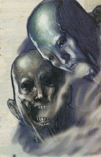
Way back in Dragon #285, James Jacobs presented the Breathdrinker: A creature of evil, elemental air that could silently steal the air from your very body. This is the illustration which accompanied the article–

I was immediately struck by how delightfully creepy they were, and in my first 3E campaign two of them were sent as assassins to ambush the PCs in the night. (This was actually in retaliation for what the PCs had done In the Depths of Khunbaral.) As I wrote in my notes:
- They come in the night.
- Glowing red eyes. Silverish-gray skin, taut against bone. Translucent and insubstantial. Glide with utter silence.
- One attacks the party member farthest from the guard. The other attempts to paralyze the guard one round later.
(If you really want to recreate the experience, I cued the encounter to track 26 on the Final Fantasy IX Plus soundtrack, which you can listen to here.)
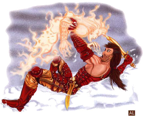
A couple years later, the breathdrinker was picked up for inclusion in Monster Manual II. And I was like, “Of course they did. That’s an awesome monster and it gave me an awesome encounter.”
Here’s the illustration which appeared in Monster Manual II:
Maybe this is an admission of shallowness on my part, but I don’t think I end up with my creeptacular encounter of eery, silvery forms if that illustration had been my introduction to breathdrinkers. (Actually, I suspect I would have skipped right over breathdrinkers and never given them a second thought.)


Man, that second illustration is pure junior high, back of the notebook scribbling. Terrible in a published work, just pure imagination killer. Numbers and stats are just the bones, but without a good picture and description, they don’t come to life at all…
I agree, that second picture is dreadful, & may even be worse than no image at all. The composition is amateurish, the lighting is flat as a board, & the action lacks weight or energy. What are the fighting on? A cloud? A wave of soap suds? A giant marshmallow? Yeah, this comes off as something a high-school student did. The details are nice, but you can only polish crap so much.
Oh, & that mullet is offensive to my sensibilities. I think it’s against my religion. I’ll check my Big Book.
Another good example in pretty much the same vein: the 3e shadow vs. the 5e shadow.