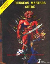
 I’ve been spending quite a bit of time delving through the 1st Edition Dungeon Master’s Guide recently. Which means I’ve spent more than my fair share of time staring at the cover… which I have always hated.
The poses are stiff. The composition boring. The anatomy problematic. It is, in short, a disappointing and amateurish piece of work.
And this is particular true when you compare it to the back cover of the same book, which depicts a glorious, panoramic shot of the City of Brass which seems to invite you to a world of adventure in a dozen different ways.
The interesting thing, of course, is that these are both the same piece of art. It’s a panoramic cover that wraps around the spine. Because of its composition, however, this can be rather difficult to appreciate unless you can look at the whole thing all at once:
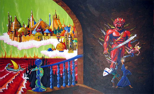
I really like the framing effect which the fully visible arch has on the City of Brass. That half of the painting is great.
Sadly, seeing the full piece in context only makes the other half of the painting look even worse. I mean, the composition of the efreeti and the adventurers was already suffering from some internal problems with its perspective. But once you put them into the context of the larger scene, where exactly are they supposed to be standing?
Look at what happens when you draw in the perspective lines of the wall:
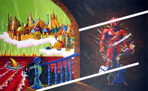
As far as I can tell, the efreeti is standing in the wall.
I’m as much a fan of non-Euclidean geometry as the next guy. But this just looks sloppy to me. And it actively repulses my eye.
EDIT: Those of you suggesting in the comments that the efreeti and possibly the adventurers have actually been painted on the wall have an interesting theory. But if that were actually the case, we would expect the cover to look something like this:
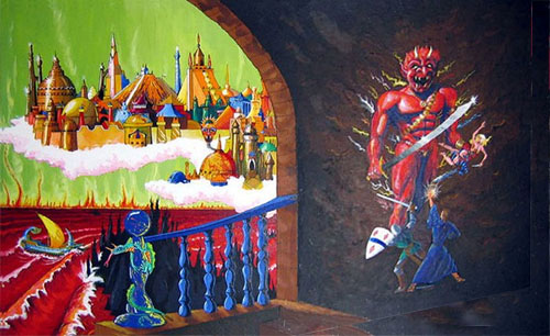
Which, of course, it doesn’t.
I suppose one could argue that this is a painting of another painting which has been painted in order to appear 3D from the position which the meta-painter has placed his easel… But, honestly, there comes a point when you’re just making excuses for sub-standard art.




In your analysis, I don’t think your perspective lines should run parallel to one another. They should eventually meet on a point on the horizon far to the right (off the page).
I don’t think perspective is this picture’s biggest problem (and, of all of the original 1e hardbacks, I think this is my least favorite). I think the stiff figures, dull seeming colors (Aren’t Efrettis on ‘fire’? I think the efreet should be blazing like a light source) and the large amount of rather flat looking black are what seem weakest to me.
I tried a ‘redo’ of the RH side of this painting on my website: http://www.stefanpoag.com/page2.html
See image #6. I think my version is far from perfect, but I think it’s a little better than the original simply because I tried to make fire that the efreeti is emerging from a part of the picture by putting shadows so it appear that the figures in the foreground were backlit and the efreet was lit from below.
Well, what if it’s not a fight, but a painting on the side of the wall? Yes, that would make it a painting of a painting, a bit more meta than you’d expect of the time, but I think it makes more sense that way. Plus, it explains the “stiff” poses.
Looks like crap, have to agree. The new pathfinder box cover looks awesome though.
What’s your favourite cover of all time?
I agree with nobodez – my first thought on seeing the whole drawing is that the efreeti and adventurers are a wall painting. Not sure if that was the intended effect, but it makes more sense that way.
I agree with nobodez–the two adventurers *must* be menacing a painting. This also explains why the efreeti’s left leg appears to end at the knee.
Not a disaster at all!
I thought they were supposed to be coming through a gate or void or something onto the plane… The railing being part of the top of a landing you would arrive/depart from?
But it is top of the list for worst art of the AD&D rulebook covers.
My best guess is that this is actually two efforts on a single panel/canvas. It was probably begun with the front (efreet) image, and then a second effort was made to expand the image to the left.
As technically awful as it may be in parts, it is iconic.
Limpey, your version of it rocks.
The Hackmaster version is more fun.
http://www.amazon.com/Hackmaster-Official-Game-Masters-Guide/dp/1889182370/ref=sr_1_6?ie=UTF8&qid=1305288583&sr=8-6
Is this really worse that the 1e Monster Manual with the Red Dragon paralyzed in midflight? Yes the perspective is off, but the DMG seems less childish than the MM.
I’m a fan of the AD&D Dungeon Masters Guide cover. Must have something to do with the 70s and hippy parents. Where did you source this image sans text? Great analysis btw, really enjoyed reading that.
I think there’s a bit of terrain missing from the side of the cover. It’s positioned to allow for being on the cover of a book so that would explain why it’s not properly aligned. It’s too bad Diesel LaForce can’t comment to clear it up, but I think that’s truly the answer.
Meg: David C Sutherland III painted this, not Dave LaForce.
Dude, the efreeti is obviously coming through the wall.