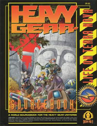
Tagline: The Heavy Gear universe is perhaps the best in all of role-playing and tactical gaming – practically unmatched in depth, detail, texture, and life. This book is the key which opens this magical treasure trove of adventure.
My first review on RPGNet was of a Heavy Gear sourcebook and I would go on to post more reviews of Heavy Gear sourcebooks than of any other RPG. This is largely because I was more enthused about Heavy Gear than any other RPG of the time: I reviewed what I read; I read what I liked. This is one of the advantages of being an amateur reviewer: The professionals only get to review some of what they read and rarely get to read what they like.
 When you delve into science fiction or fantasy you will often find yourself encountering worlds either entirely separated from our own or at least placed so far in the future that the extrapolations from our current time have rendered them almost wholly different from what we know. When you encounter these worlds you will find that they often break down into two broad categories – those worlds which might actually exist and those worlds which have clearly been created merely to suit the whims of the author’s story and couldn’t possibly exist.
In role-playing we have all encountered the latter many, many times. (“If this dungeon is so close to the town why hasn’t it been looted over the centuries?” “Because the locals are all frightened by the monsters.” “Yeah, speaking of those monsters – what are they eating down there?” “Look, do you want to play or don’t you?”) Fortunately those of the former have grown increasingly frequent in our hobby (although, frustratingly, we are often prohibited from playing certain characters by the rules of the game).
Sometimes, however, you come across a real jewel of a world. A world so intricately detailed, so deeply described, and so excellently constructed that you realize that not only can you tell “science fiction stories” in this setting, but any story in this setting. Terra Nova – the world of the Heavy Gear game – is such a world.
THE WORLD OF TERRA NOVA
For more details on the history of humanity (which is presented in great detail within this volume) in the 4000 years which separate its time and our own see my review of the second edition of Heavy Gear elsewhere on RPGNet the Alexandrian.
Terra Nova is a world divided into two lush polar regions by the great deserts referred to collectively as the Badlands around its equator. Following a period of chaos in Terra Nova’s past the two polar regions coalesced into a series of leagues. Those leagues eventually allied with themselves to form the two great polar alliances – the Allied Southern Territories (AST) and the Confederated Northern City-States (CNCS). The Badlands have a few centers of power in the forms of city-states, but are largely settled only by isolated villages which are focused around “oasis towers”. Because the Badlands generally lacks the political power of the two polar alliances, it is easily exploited as a “neutral” battleground between the two. A little over a decade ago all of Terra Nova came together in order to beat back aggressive conquerors from Earth who had returned to reclaim their colony.
To begin in the south, the AST is composed of four leagues – the Southern Republic, the Humanist Alliance, the Mekong Dominion, and the Eastern Sun Emirates. The Humanist Alliance was, in fact, the first league to form on Terra Nova. Based on the teaching of Yuri Gropius it is a realized utopia similar to the teachings of the ancient Greek philosophers (most notably Plato) – the only price of this utopian existence is freedom. The Mekong Dominion is a society based entirely upon the corporate structure. It is the economic and production center of the entire South. The Eastern Sun Emirates is a feudal society which formed around the power garnered from the distribution of supplies from the space freighter the Eastern Sun during the time of chaos which plagued Terra Nova centuries ago. Finally, the Southern Republic is supposedly a free democratic society – in truth the people have bargained away their power as voters in exchange for a comfortable and luxurious lifestyle. Further, the Southern Republic rules the AST – having been responsible for its formation in their wars of aggression.
In the North the CNCS is composed of three leagues – the Northern Lights Confederacy, the United Mercantile Federation, and the Western Frontier Protectorates. Similar to the Mekong Dominion the UMF is focused upon production. Unlike the Dominion, however, the UMF focuses more heavily upon the work ethic than upon the philosophy of “business is war”. The society of the WFP is focused upon its military forces. Like the society detailed by Heinlein in Starship Troopers (the book, not the movie) only citizens who have served in the military for a certain amount of time are allowed the right to vote – not out of fascist beliefs, but out of the belief that only those who are willing to die for their country should be allowed to control the destiny of their country. The NLC is a democratic society which is increasingly dominated by religious fundamentalism – although it, like the Southern Republic, is both the most powerful league of its alliance and has fought wars of aggression in the past it did not – like the Republic – force the formation of its league, and does not rule it with an iron glove.
There are two important city-states in the Badlands – Peace River and Port Arthur. Peace River is ruled by a company known as Paxton Arms, and most of its citizens are employees of the corporation. Peace River and Paxton Arms have recently come into conflict with Port Arthur (a city-state established by Earth troops abandoned after the recent invasion, but which has since become a haven for Badlanders in need) because both city-states see it as their duty to protect the Badlands – and have different ideologies about how that protection is to take place.
This, in brief, is a broad picture of the world. Unfortunately I cannot go into the details of this world – unfortunate because it is in the details that this world truly shines. Every league (and the Badlands as a whole) is a hotbed of activity. Besides the main conflict between the CNCS and AST (and, indirectly, the NLC and Southern Republic), there are numerous other conflicts at large. The Badlands are torn apart by the Badlands Revolutionary Front, the Saragossa People’s Front for Independence fights the oppressive government of the Southern Republic, revolutions dot the Eastern Sun Emirates, the Humanist Alliance is attempting to secretly prepare for a break from the Southern Republic, and the entire globe is plummeting towards war.
Beyond simple conflict, this world is exquisitely detailed. Not only do you learn of the “big picture”, but you learn the little details which can be so important while roleplaying. What foods do people eat in a given location? What drives the local economy? What do people wear? What music is popular right now?
You will be hard put to find a campaign setting – particularly a science fiction campaign setting – on the market today that allows you so many options and provides you with so much detail.
CONCLUSION
Although not a direct part of this product, it is important to remember that the story of Terra Nova is not only evolving – it is evolving in a very deliberate, easy to understand, easy to follow method that is alien to nearly every other game system I have ever encountered. (See my review of the second edition rulebook for more details on this.)
As a result in buying into this world you not only buy into a world of incredible depth and detail – but a world where that depth and detail is evolving and progression.
In short, not only should you buy Life on Terra Nova because of the incredible strength of the product itself, but due to the incredible strength of supplementary products which the purchase of this book will open up for you.
Style: 5
Substance: 5
Author: Gene Marcil and others
Company/Publisher: Dream Pod 9
Cost: $19.95
Page count: 160
ISBN: 1-896-776-00-0
Originally Posted: 1998/05/16
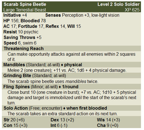


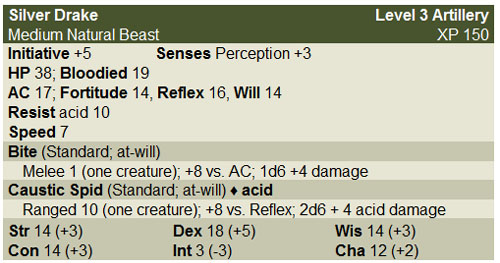
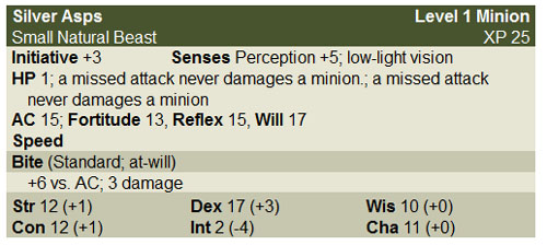
 BACKGROUND: Over the past few months, intermittent meteors have been hitting the area around town. The force of the meteor impacts (or perhaps something special about these particular meteors) have been tearing open interdimensional rifts. Locals have started referring to them as “techno-meteors” because high-value tech has often been found in the area around the impact craters.