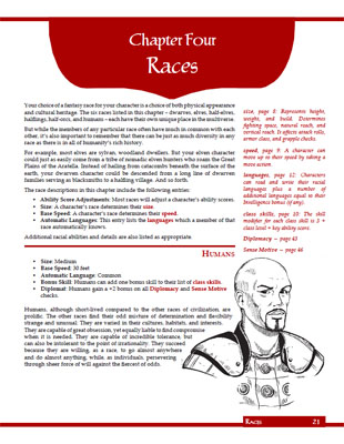
A couple days ago we had a class preview by taking a peek at the fighter. Let’s go ahead and preview the races… all of them.
Yup, that’s the entirety of Chapter 5 there.
The artwork in this chapter is by Larry Elmore, used under license. His artwork opened the doors of fantasy roleplaying to me, and I can’t think of a better way to capture the iconic images of the core races. (With that being said, I made a couple of “risky” choices in here and it’ll be interesting to see how people respond to them.)
One semi-interesting thing of note is that, in writing this chapter, I very specifically did not want to give humans primacy by placing them at the top of the chapter. Instead, I wanted them to appear in their proper place in the alphabetical order. But when I got to the actual layout, I ended up with a space at the bottom of the first page that was too small to fit dwarves into. I initially planned to fill it with some generic artwork (with the intention of possibly replacing it with a “fantasy line-up” as a commissioned piece of art). But then, when I tried to place the entry for humans later in the chapter, I either ended up with a page filled with white space or crunching a whole bunch of races up into a space that was too tiny for them.
Eventually, it just made sense to use the humans to fill that white space on the first page and embrace a consistent approach of “1 race per page”. It still leaves more white space in this chapter than anywhere else in the book, but sometimes you just have to embrace what fate is telling you.
As I mentioned in the class preview, I decided to go with a Gang of 6 character classes and then matched this with six character races: Humans, Dwarves, Elves, Half-Elves, Halflings, and Half-Orcs.
Here, too, I had seriously considered sticking with either the “classic three” (humans, dwarves, elves) or “classic four” (throwing halflings in there). But getting half-breeds into the mix, in my opinion, establishes an important “conceptual beachhead” in the pastiche fantasy-land at the heart of the game.
So… half-orcs to fill the role of “bruiser” and “outcast” that isn’t well-covered by the other races? Or half-elves, like halflings, out of respect for their Tolkienesque roots?
Eventually, I decided that including both would (a) provide some nice variety within the general type and (b) balance the game evenly with six races and six classes.
I am aware that this means only gnomes are excluded among the core D20 races and that, therefore, I run the risk of being classed among the “gnome haters”.
But that’s a risk I’m just going to have to take.
CLIMB INTO YOUR LABYRINTH AND FORGE YOUR LEGEND TODAY!


Looking over the races excerpt, I see a mix. I like the way you have condensed the descriptions of the races and think the SRS works well here. Unfortunately, I see a couple of problems.
The first is that you have made humans good diplomats. I suppose this makes sense given how the game defines half-elves, but it is a little jarring, and it reduces the differences between humans and half elves.
The second is the flavor descriptions for the races. Calling the half-elves “bastards” seems uncalled-for, especially since it is by no means clear that half-elves have to be illegitimate. Far worse is the half-orc description, which starts off with “bestial rape” and moves on to infanticide.
I have several problems with this. First, it is unnecessarily dark and grim for a game that has historically never been either. Second, it is a change from the description of the 3e race. Third, it unnecessarily limits the campaign choices for the players and DMs. What if there are half-orc tribes on the frontier, for example? Fourth, no introductory game should include words like “bastard” and “bestial rape” in it.
It’s totally unnecessary and therefore, twice as annoying that this has been put in where it didn’t exist before.
This PDF excerpt was interesting for me what I guess you’d call “UI” reasons.
Firstly, the red-highlighted words drawing your attentions to the sidebar definitions and references works really well. I like it a lot, it lets the main text “flow”, provides minimal definitions that will often be sufficient, and shows you where to go for more detail. Great stuff.
The chapter number on the side of the page, however, is completely useless. The excerpt is from chapter 4, as shown by the big red “4” on the side of each page. Uh… so what…? If I’m flicking through the book looking for races, how do I know that chapter 4 is the one I want without reading the page itself anyway? If chapter 4 isn’t what I want, how do I find out what chapter I do want without checking the index (which will give me a page number anyway)? What’s in chapter 3, or 5, or 12? If I decide to look for classes next, where do I go for that? I have no idea – so that big red “4” provides exactly zero value.
A much better method – though admittedly one that takes more space, and your pages are already short on space due to the useful SRS – is one that I saw in the Dragon Age: Origins complete guide. It lists all the chapters first, highlighting the current one and fading the rest. Then it lists the content within the current chapter, again highlighting the current location (this needn’t be page by page, just topic by topic). So the navigation sidebar for one of these pages, say the Halfling page, might look something like this:
1 – introduction
2 – how to play
3 – creating a character
***4 – RACES ***
5 – classes
6 – skills
7 – equipment
8 – spells
9 – sample quest
Races:
human
dwarf
elf
*** HALFLING ***
half-elf
half-orc
That’s a million times more useful than just a big red “4”. Navigation within a book like that is fast and easy. Need to find the rules for the Summon Bigger Fish spell? Open *any page in the book* and you can instantly work out which chapter you need to go to, and whether to flick backwards or forwards to get to it. It’s brilliant… it’s like having an index on every single page. Unlike just a big red “4” which adds no information whatsoever.
Interesting. I can definitely see how useful that could be. Particularly if you dropped one into the sidebar on the left and the other into the sidebar on the right.
Ultimately, as you say, the problem is one of space. Initially I was going to have the full chapter name on the reference tab, but it ended up taking too much real estate away from the SRS.
So I dropped the chapter name down by the page number.
But the smaller tabs retained some utility because, as you flip-through, their shifting position on the margin is an immediate visual cue that “you’ve reached a new chapter”. In addition, I’ve found that as I gain familiarity with the printed rulebook they actually do help me zero in on the chapter I’m looking for. Once you know, for example, that Combat is Chapter 12, the tab helps you zero in on that.