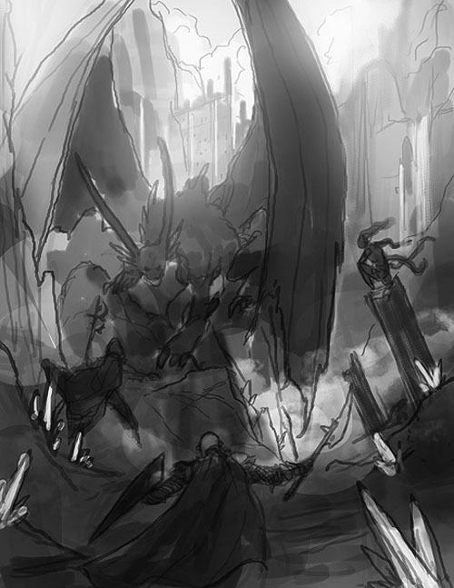
Preliminary Cover Sketch – Viktor Fetsch
Getting the art I need for Legends & Labyrinths continues to be a struggle. It’s a project that has been a monkey on my back for a long time; and as Zeno’s Paradox seems to invoke itself as I get closer and closer to its final completion, it feels like that monkey has been chowing down on neutronium.
But the process has not been without its joys. And watching Viktor Fetsch’s beautiful illustration for the cover slowly evolve and emerge has been a particular high point. Over the next week, I’m hoping to share a (rapidly accelerated) version of that experience with you.
We start today with the preliminary sketch Viktor gave me for approval before launching into the final piece. Prior to this, I had given him an art order which looked like this:
3 CORE ELEMENTS: 3 iconic heroes; fighting a dragon; in an evocative ruin.
DRAGON: Dead or alive. (Or both.)
RUINS: A sense of preternatural age. The majestic contours of long-lost civilizations. Whisper the suggestive echoes of a thousand, limitless stories.
HEROES: Three major fantasy archetypes — Fighter, Wizard, Rogue/Assassin. There should be no sense of these characters as “posing dramatically”, but rather being captured in a real moment. We want realistic armor. At least one of the heroes should be female. Consider having the heroes facing “away” from the camera: I don’t know if that’s necessarily right, but I am struck by how it invites the viewer to either identify with the characters or think of themselves as “the fourth member of the party”. Not a passive viewer, but a participant sharing in the same experience/vista.
3 KEY NOTES: A depth of field which invites the viewer into the sense of a wider world. The heroes and dragon interacting with the environment (dragon gripping a piece of ruin; flame washing around a rocky protuberance; one of the heroes hiding behind a wall; something like that). A “wow” element that’s not immediately apparent, but makes the image more than just a generic scenario.
If you had to describe the perfect cover for a fantasy RPG, what would it be?


Coincidentally, this more or less describes the cover of the Pathfinder RPG core rulebook. 🙂 Ok, it has 2 characters insetad of 3, and they are not positioned away from the camera, but otherwise the same concept.
I don’t mean to come across as accusing anyone of copying anyone; rather, I think the “heroes fighting a dragon” is such a classic fantasy RPG trope that it’s a great choice for the cover of a core rulebook, and is perfect for drawing in potential new players who might spot the book on a shelf.
Looks great so far, BTW. Can’t wait to see the final version!
All it’s missing is a glimpse of the Dragon’s hoard
I must admit I’m partial to non-picture covers. The traveller rulebooks or 3.0/3.5 basic sets. I’ve been looking through the rulebooks on my shelf before writing this, and the only pictures on the cover that I really liked were the one from the 3.5 Complete.. series. Just a single character inset into one of the faux old-book covers. Wouldn’t work for a core book though.
Interestingly enough, I think several of the pictures would be interesting and evocative if they were inside the books. Not quite sure why I don’t like them on the cover.