Rough Cover Progress – Viktor Fetsch
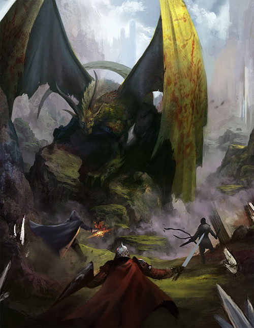
A couple days ago, we took a peek at the preliminary sketch Viktor Fetsch produced for the cover of Legends & Labyrinths. Here we see the cover as a work-in-progress, as it reaches roughly the 75% point of its completion.
One of the things I like about this piece is that the dragon feels traditional at first glance, but has a uniquely fiendish cast to his features upon closer inspection. There is a depth of both physical and conceptual space which draws my eye into the work and makes me want to step (or charge) into that world.


It’s a much cooler perspective than a “party on right, dragon on left” Final Fantasy-style combat. It looks like something you couldn’t set up on a grid, so it makes this game look cooler than D&D.
Some of the stuff that I really liked with the previous picture was the waterfall and the building in the distant background. Seemed to indicate that this wasn’t just a set-piece, but merely a step on the road, with more adventure farther ahead.
I’m a bit sad that those elements seem to have been washed out by the background fog.
I agree with Rubberduck; Where are the “evocative ruins” you asked for?
Your blog entry perfectly describes my reaction towards this book:
1. “Oh, so it’s a Green Dragon. Nice they get some love, too”
2. “Wait a sec, something’s not right…”
3. “OMG, what kind of hellspawn is this?!”
4. ???
5. PROFIT!
Let’s wait and see what the remaining 25% have in store for us!
Wait, why did I wrote book? Never mind, better make something producte with this double pos XD
@Doodpants
There are some pillars to the right, as well as some kind of castle in the background.
And is it just me, or does this dragon-fiend-thingy has a dragon head tattooed on his wing – with blood?!
I agree with Rubberduck and Doodpants – it seems like the ruins have been somewhat washed out; if I hadn’t seen the previous image (and thus known they were supposed to be there), I don’t think I would have noticed them. Which is a shame, since they were a great element in the first picture
I don’t think I emphasized the “work-in-progress” nature of this rough sufficiently: You’ll see a lot of the missing details are still there in the final product!